Never Waste a Project Lull

The nature of project work is that there are often periods of inactivity—both during the project (while waiting for feedback, for example) and between projects. It’s easy to piss away these lulls—you’re exhausted from doing the project after all—but you can also use the time productively by hunting and gathering.

Hunting involves finding new experiences to fill up the creative tank. The best creative practitioners are often those who can draw ideas from other fields, to make disparate connections to find solutions. Trying something different, even if it is just a new restaurant a little farther away, can provide new ideas, new stimulus. “Too often, we fail to consider the ways in which our surroundings constrain our creativity,” writes Jonah Lehrer. Doing or seeing something new stretches our creativity and gives us more raw material to work with when we return to work. You don’t have to skydive or travel to Bhutan, you just have to experience something not usually in your path. Whatever you do, don’t just sit at your desk, mindlessly surfing the internet. “We don’t know where we get our ideas from. We do know that we do not get them from our laptops,” notes John Cleese. Exactly.

Gathering involves reflection, thinking about the work that has already been done and figuring out the lessons learned. Especially if you write your thoughts down, gathering gives you another source of raw material: for blog posts, for presentations, and just for understanding your own work. Sometimes a pause lets you examine not just what, but how you did something, and why. (Definite shades of Donald Schön’s The Reflective Practitioner here.) If you can’t reflect on your work, and in particular the mistakes you made while doing your work, you won’t grow.

Everyone fixated on the 10,000 hours of practice to become an expert that Malcolm Gladwell illuminated in his Outliers book. But what he pointed out (and that everyone forgot) was what that what you did during those 10,000 hours mattered. Practice entails doing an activity, then honing it through reflection. You can do an activity for 10,000 hours and still suck at it if you’re not thinking about what you’re doing, then correcting your mistakes. A project lull is a perfect time to do this sort of gathering.

So yes, while you could dull yourself with ‘net surfing, YouTube watching, and general goofing off (all of which has its place as well), you could take some small steps to better yourself, so that when project work resumes, you’re ready.

Save Save As

A Golden Rule of interaction design is that if you change an interface convention, the replacement had damn well be better than the convention you replaced. Demonstrably better. By this standard, OS Lion’s “Save As” replacement “Save a Version” fails. Epic Fail, in fact.

In Ye Olden Days of GUI (Apple’s Lisa and the Xerox Star), “Save” used to be “Save and Put Away” (Xerox Star) or (as an option with Save and Put Away) “Save and Continue” (Apple Lisa). “Save and Continue eventually just became “Save” while “Save and Put Away” vanished, probably once RAM and memory allowed for multiple documents to be open at the same time without processor issues. “Save As” seems to have begun in the 1980s as “Save a Copy as,” and eventually some applications had all three: Save, Save As, and Save a Copy as. (What the difference between Save As and Save a Copy As are unclear to me.) Eventually, as people understood the Save As paradigm and with the broad adoption of the Undo action, “Save a Copy as” has mostly vanished. You can still occasionally see “Revert to Saved” in file menus.

In any case, the mental model of Save As has been fairly stable for at least 30 years now. You change the document, then you give it a new name. Apple’s new model seems to be the reverse: I’m going to change this document, so I need to Duplicate it, then change it. Old versions inexplicably lock, although I’m at a loss for when and why. (At least I think this is how it works: the mental model makes no sense to me.) Ostensibly, this is because Apple has an autosave that let’s you go back to previous versions. They thought somehow this would obviate the need for Save As.

But this is not how most people work (or, more precisely, how we’ve been trained to work over the last 30 years). This change breaks the mental model hard and replaces it not with anything better, but with a paradigm that is very difficult to understand (and poorly executed to boot). Most people don’t need the previous version of their document open at the same time as the altered version. Versioning is what programmers do, not what normal people do. When I (infrequently) need the earlier version of a document, I’ll manually open it. When I initiate a “Save As” I’m explicitly saying “This is a new thing, made from the previous thing. It’s a separate entity, deliberately established by me, not a “Duplicate.” I don’t want to “Save a Version,” I’m really making a new version, often one that involves putting this new version into a different folder. With Save a Version, I’m ending up with all these weird copies of documents that are difficult to determine which one is the most recent. Is it the “copy?” I don’t know.

Here’s a test, interaction designers. If you can’t easily diagram the logic of a feature, no way in hell are users going to figure out the mental model of it, unless you provide some easy means of making a “false” model that nonetheless allows users to figure out what is going on. This feature can’t be diagrammed easily (I tried) and the terminology around it doesn’t provide clarity.

This is the first time in a long time I’ve felt something that makes sense only for programmers has made it into an Apple UI. There’s no way Steve Jobs signed off on this change. It’s either too complicated, executed badly, or explained poorly—or all three—and those are not attributes I expect from Apple design.

Windows 8, The Ribbon, and Designing with Data

I was going to call this post, “Thinking the Unthinkable about Microsoft,” but what I’m going to say isn’t really unthinkable. In fact, I’ve thought it several times in the past four years, starting with Office 2007 and the introduction of The Ribbon as a UI element and continuing on through Kinect, and Windows 7 Mobile. What I’m thinking is namely this:

Microsoft is doing some good design work, particularly interaction design work.

I know, right?

Let me preface this piece by saying I’m mostly an OS X user, with occasional forays into Windows 7, which I don’t particularly like. I use MS Office just like most of the planet, however.

What prompted this post was a post on the MS blog about adding The Ribbon to Windows 8 Explorer. It’s a fascinating piece, and kudos to Steven Sinofsky and Microsoft for publishing it. We so seldom get to see design decisions as they are being made and the data—data!—that is being used to make them. Can you imagine Apple or even Adobe doing this? Me neither.

Of course, it being Microsoft, there was an immediate slam that quickly spread around the interwebs. The gist of the criticism is that Microsoft’s own data is showing how their new design is stupid. First, some quick background:

I know a lot of people hate The Ribbon as a UI element. It definitely took me a while to get used to it as well. But if you watch Jensen Harris’ The Story of The Ribbon or read the Office 2007 blog (recommended), it gives you an idea of the kind of constraints they were working under and their reasoning for creating for The Ribbon. Working on software with an established user base in the hundreds of millions is no easy task. Add to that organizational pressures, the hundreds of features you need to include because of business and power-user requests/demands, and you have a difficult design challenge, the likes of which most designers will never face. Hell, most designers within Microsoft didn’t fully address the challenges Office presented, which is how we got Office 2003. It’s a significant challenge, and if you don’t think so, try redesigning MS Word yourself, given what you know about the internal constraints. And then present your radical redesign of a company cash cow to Ballmer and Gates. Most of you would wet yourselves in response. I contend that The Ribbon was a bold, excellent response to the challenges of Office. I’d be proud to have it on my resume.

Now, whether The Ribbon is a good choice to use within the operating system and not within the suite of Office apps (where it was designed to be) remains to be seen. Sinofsky says in the article they explored other UI means, but eventually settled on the Ribbon as the way to go.

Now back to the data. Microsoft anonymously collects user behavior data, which can be illuminating. It basically helps determine what goes into the Ribbon on any given screen. Note that I said helps. Because here’s the thing about data: it can’t design for you. You need a human being—a designer—to interpret the data, and then place it into context. The data needs to be made meaningful, which sometimes means ignoring it.

Ignore it? WTF! Why would you ever ignore data? Here’s the simplest example: most online advertising isn’t clicked on. If you get a .5% clickthrough rate, you’re often doing very well. So should we remove all online ads, since they are so seldom used? 99.9% of users think so (the other .1% of people work for advertising agencies). But getting rid of advertising for some sites would mean basically getting rid of the site itself. Would you like Google to go away? You can’t listen to the data because the data doesn’t understand the overall context: the business and organizational environment and the user base as more than numbers on a spreadsheet.

There are plenty of reasons why a designer wouldn’t just make all the highest-use items visible:

  • You’re trying to increase the use of a feature. Some features people clamor for are buried and thus have low usage. Bringing them forward and making them more prominent is a way of encouraging greater use.
  • You’re helping power users. A tiny sliver of your audience might be power users, so overall, it looks like the usage percentage is low. But those power users really need that feature and will scream bloody murder if it is hard to get to.
  • Clustering the same kinds of commands together. Probably almost no one uses a command like Paste as Hyperlink, but users wouldn’t be wrong to expect Paste as Hyperlink to be near Paste.
  • A feature is part of a workflow. Occasionally, several commands will typically be done in a sequence. For example, scaling after importing an image. Now, users might not scale every time (and thus the use data is lower), but a good designer will know the flow regardless of what the data seems to be saying and design for the flow.
  • You’re introducing a new feature you think people will like, but there’s no user data for it yet.

In short, data can be misleading and needs human interpretation. It can be a mistake to do a one-to-one mapping of high-use items onto the home screen. If you don’t believe me, look at Office 2003, because that’s the solution they tried there. You can end up with cluttered, non-sensical screens that (especially your power) users will hate.

Note that this is not to say that data cannot be misinterpreted by a designer, sometimes willfully so. (See my talk How to Lie with Design Research for helpful tips on manipulating data.) Designers are all too human and make mistakes too.

But before you look at behavioral data mapped to a UI (which is an amazing giveaway in the first place) and make judgements about how the data was utilized, realize you’re only seeing part of the picture. What you’re missing is the constraints, a knowledge of the users, and the organization and product history that a designer will bring to bear on the problem. Designing with data should mean using data as an input to your decision-making, not as the decider alone.

Help Me Find My Next Adventure

I’m looking for a new professional home. I’ve been talking to some interesting companies, but I thought it might be good to spread the net wide.

I’m looking for a position leading a team of designers as a creative director, director of design/UX, or VP of design in San Francisco or nearby. (Or one that would allow me to work in SF remotely.) I enjoy the pace of agency life, but would equally like a really interesting product. Dog-friendly office a plus!

My preference is to working on consumer projects that go beyond web or a single app, preferably in the hardware/software space: devices, robots, consumer electronics, appliances, etc. I’m an expert in touchscreen and gestural interfaces, as well as web, mobile, and desktop apps.

Here’s my resume (pdf) and my portfolio. Contact me if you have or know of a good fit for my experience and interests. Thanks!

Lessons from the First 50 Days of 100 Days of Design

Fifty days ago, on March 1, I started a 100 Days of Design challenge. Basically, the idea is you do one design exercise once a day, every day, for 100 days. By sheer repetition, you get better at whatever it is you do; over time, you see more facets to the activity, more variations. It’s like scales and etudes. But it’s also difficult; most (all?) of the people who started the challenge with me have stopped.

Every day, I spend about 15 minutes doing a small (6″x6″) expressive typography piece, based on a music lyric I heard that day. I put them all together on one giant poster that will be 10′ tall when I’m done.

I think it’s a worthwhile challenge and I feel I’m getting better at thinking in type. So what I have I learned by doing it thus far? A few things:

  • Watch for happy accidents. Every once in a while, I’ll accidentally do something while playing around and it is much better than anything I’ve thus far thought of. The trick is to go with it and to remember what you did, so you can use the unexpected trick elsewhere.
  • Style is finding little tricks you like, then repeating them for different effects.
  • Let the type speak. Some of my favorite pieces I’ve done have been the ones I haven’t overly fussed over, where the type matched the words very well, and I did just one or two manipulations of the type.
  • Don’t be too cute or too literal. It’s really easy with some pieces of text to do silly things with the type to make them illustrate the words. It comes off lame. A little emphasis goes a long way.
  • The whitespace matters. Typography 101. Whitespace can really make tension and drama. It can also ruin your concept by being more prominent than the type.
  • They aren’t all gems. I picked out eight pieces I liked and thought were good (see below). That’s eight out of 50, or 16%. Meaning the vast majority of what I’ve done I feel is mediocre or best. (Hell, you might think my best are all mediocre at best.) But that’s the whole point of this challenge: to do a lot to find a few that are good. Hopefully, by the end of the 100 days, I’ll have a higher success rate, but realize that even at best, half of what I come up with isn’t going to work. And that’s ok.

My favorites from the first 50 days:


(Looking at these, all I can see is kerning I want to tweak. Ah well.)

Looking for a Designer to Mentor

I’m looking for a designer to mentor. What I’m offering:

  • Six months of mentoring, renewable if it’s working out
  • Review any work you want: sketches, deliverables, finished products, pieces of writing, etc. It can’t be overly time-sensitive though; no “OMG, the client needs to see these in an hour and I need your help!” kind of stuff. More like, “How could I make/have made this better?”
  • Help with career planning: what you should do, who you should meet, etc. and help arrange introductions if possible
  • General advice

I’m looking for a particular kind of designer to mentor, though, as I think I’d probably be able to help this type of designer out the most. Who you are:

  • Early-career (2-3 years+) interaction/UX designer: not fresh out of undergrad
  • Wants to or (preferably has) written articles and/or conference presentations
  • Works with complex problems—I’m not going to be much help with marketing or branding work
  • Interested in more than web
  • Comfortable in English. Alas, I don’t speak any other language well enough to be able to effectively tutor someone in it.
  • Doesn’t mind the occasional blunt advice and criticism
  • A sense of humor
  • Willing to deal with me mostly via email and IM. If you’re in SF, we’ll get beverages occasionally.

I’ll try to help guide you as best I can.

UPDATE: I’ve found three people to mentor and applications are hereby closed. Thanks for your interest!

100 Days of Design

Yesterday, I found myself reading Michael Bierut’s exercise he gives his graduate students at Yale: do a design exercise every day for 100 days. The same exercise, repeatedly. At the same time, I also happened to read this article by Sebastian Marshall about the importance of doing quantity, not quality, if you want to improve.

I mentioned on Twitter how I’d like to do this exercise one day, and got a challenge from Livia Labate: let’s do it now. If we start on March 1, it would be finished on June 8.

Because I’m insane, I said ok.

I had to find something to do, so I thought about it for a while. I wanted something that would come together to make something, yet mark the distinct days. I wanted something that could be done in under 15 minutes a day, preferably less. And I wanted something that related, however tangentially, to my day. What did I do every day already?

Aside from sleeping and eating and other hygiene (none of which would mark a day very distinctly), the one thing I do every day without fail is listen to music. Sometimes obsessively listening to the same song over and over. Sometimes the songs are meaningful, sometimes just a song. But it’s usually interesting. So my project would be around that.

I also thought back to some of my favorite assignments from graduate school, and I remembered one Dan Boyarski gave us when I first started and the Onomatopoeia Project from Kristin Hughes in Grad Type. I enjoy playing with type, so I decided on a typography project.

So here’s what I’m doing: every day for the next hundred days, I’m going to take the song I’ve listened to the most that day, pull out a meaningful or memorable lyric, and make it into a piece of expressive typography. Each day I’ll have a 6″x6″ square to put the type in. Then, I’m putting them into one enormous poster of 20 rows with 5 lyric squares each. On June 8, I should have a 3’x10′ poster (at least) of the project. I’m using whatever font works with that day’s lyric, presented in any way I want (as long as it’s in the 6″x6″ box). I started the project today with a lyric from The Beatles’ “Free as a Bird.”

Wish me luck.

2011 Professional Goals

Launch a working product of my own. Not a concept project and not a client project. A product I can unequivocally point to as my own design that others can use.

Write more. A blog post a week, and a longer article on Designing Devices once a month.

Sketch more. Improve my freehand drawing and noodle on ideas. Instead of a laptop or iPad to fill in the gaps of the day, sketch.

More storytelling in presentations. Telling stories is a great way to engage the audience. I need to incorporate them more into my talks.

More outreach. Less dealing with the design community, more engagement with the broader business and tech worlds. More going after projects I want to work on.

Another strong program for Device Design Day. The first Device Design Day was a success, with a great lineup of speakers. Build on that.

Improve The Interaction Design Library. Add excerpts or summaries to all entries in the Interaction Design Library. Link to a twitter account. Find buried gems.

Create an Interaction Design Glossary of Terms. Use the canonical books in the field to create a glossary for everyone to use.

My Favorite Design Articles 2010

Better than the stuff I wrote in 2010 are a bunch of really great articles I’ve read and enjoyed (and have influenced me) throughout the year. Here are my favorites (in no particular order):

Tips on Buying Design by Mike Montiero
“Most people don’t need to buy design. And only about half the people trying to buy design should be. Your designer should be a partner, helping you solve your problem. You have a goal in mind; the two of you work together for a solution. Getting to that solution includes researching the people you want using your object, the market for that object and who, if anyone, is trying to sell that same sort of object. If all of that sounds like a pain in the ass, and it kind of is, then don’t buy design. Hire a production team. You’ll save money.”

User Experience Matters: What Entrepreneurs Can Learn From ‘Objectified’ by Om Malik
“Most companies (including web startups), he said, are looking to “wow” with their products, when in reality what they should be looking for is an “’of course’ reaction from their users.”

A not-so-brief chat with Randall Stephenson of AT&T by Fake Steve Jobs
“Point of the talk was, when you’re lucky enough to create a smash hit product — when the stars align, and the hardware is great and the ecosystem is great and the apps are great and the whole experience is great, and everything you do just makes everything else better, and you’re totally on a roll and can do no wrong — when that happens, you do not go out and try to fuck it all up by discouraging people who love your product. What you do, instead, is you fix your fucking shitty ass network you fucking shit-eating-grin-wearing hillbilly ass clown!”

We Are All Talk Radio Hosts by Jonah Lehrer
“The larger moral is that our metaphors for reasoning are all wrong. We like to believe that the gift of human reason lets us think like scientists, so that our conscious thoughts lead us closer to the truth. But here’s the paradox: all that reasoning and confabulation can often lead us astray, so that we end up knowing less about what jams/cars/jelly beans we actually prefer.”

The Measure of a Designer by Nancy Sharon Collins
“From my mother, I learned perfect composition and can identify incorrect measurements down to a 64th of an inch with my naked eye. In the cold O.R. at New York’s Lenox Hill Hospital, the Park Avenue plastic surgeon was chagrined when I said I wanted to tell them where I wanted the two new concentric circles that would be my nipples and areola to be placed. We argued—the surgeon’s assistant wanted to measure and I said, no, this has to be done optically. Thus I stood buck-naked before a mirror and the 12-member surgical team, with a Sharpie marker in my hand. To my satisfaction, when the surgeon’s assistant measured my work with his millimeter ruler, it was quantifiably perfect.”

I Jump for Cash Bitch by Robert Schaefer
“You have until 10am tomorrow morning to send me the business card artwork or you will hear from my lawyer. I am sick to death of dealing with you designers. Being able to draw and dressing like women doesn’t make you special.”

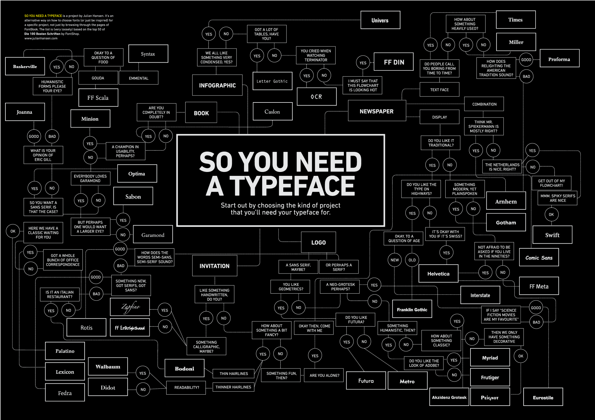
So You Need a Typeface by Julian Hansen

Design Thinking: A Useful Myth by Don Norman
“A powerful myth has arisen upon the land, a myth that permeates business, academia, and government. It is pervasive and persuasive. But although it is relatively harmless, it is false. The myth? That designers possess some mystical, creative thought process that places them above all others in their skills at creative, groundbreaking thought. This myth is nonsense, but like all myths, it has a certain ring of plausibility although lacking any evidence. Why should we perpetuate such nonsensical, erroneous thinking? Because it turns out to be a very useful way to convince people that designers do more than make things look pretty. Never let facts stand in the way of utility.”

The Evaporative Cooling Effect by Xianhang Zhang
“The Evaporative Cooling Effect is a term I learned from an excellent essay by Eliezer Yudowsky that describes a particular phenomena of group dynamics. It occurs when the most high value contributors to a community realize that the community is no longer serving their needs any more and so therefore, leave. When that happens, it drops the general quality of the community down such that the next most high value contributors now find the community underwhelming. Each layer of disappearances slowly reduces the average quality of the group until such a point that you reach the people who are so unskilled-and-unaware of it that they’re unable to tell that they’re part of a mediocre group.”

Google Maps and Readability by Justin O’Beirne
“For months, I’ve been trying to figure out why Google Maps’s city labels seem so much more readable than the labels on other mapping sites.”

Explain the Internet to a 19th Century Street Urchin by Doogie Horner

Why Pioneers Have Arrows in Their Backs by Steve Blank
“Over time the idea that winners in new markets are the ones who have been the first (not just early) entrants into their categories became unchallenged conventional wisdom in Silicon Valley. The only problem is that it’s simply not true.”

The Design Lesson: 1 of 1 by Andy Rutledge
“In graphic design, nothing is what it actually is. Everything other than content is representative of something else. Additionally, much of the content is also merely representative of something other than what it actually is.”

Why Innovation is Beginner’s Luck by G. Michael Maddock and Raphael Louis Vitón
“‘You can’t read the label when you are sitting inside the jar.’ This is how we like to describe the myopia that comes with being an expert. And odds are you are a myopic expert. That makes you vulnerable to people who come into your industry from the outside, and it limits your ability to come up with revolutionary new products.”

Build What Had Previously Not Been Possible by Jason L. Bapiste
“If you’re an entrepreneur looking to change the world it all seems to start with a simple little idea. It may seem as if the idea sprung up instantly, but it’s most likely a compilation of building blocks. Over the course of history new building blocks become available, which allow us to build companies that weren’t possible before. The crucial part to changing the world as an entrepreneur is to use these new building blocks to build what had previously not been possible. When looking at an idea it’s useful to ask yourself: ‘Would it have been possible to build this company 12-18 months ago?'”

Ideas Are a Commodity, It’s Execution Intelligence That Matters by Rob Adams
“One characteristic I run into when sorting this out with companies is an obsession around the uniqueness of the idea. Somehow there’s an urban legend that has denigrated to an obsession that the idea is king; it is what will make or break the new offering. The idea somehow must be unique and stand-alone in its market. The simple act of describing it needs to cause people to take out their wallets and give you money –or- cause your competitors to copy it. Prepare to be disabused of that notion. Your idea doesn’t matter.”

Engagement, Entertainment, or Get The Task Done: Cognitive, visual, and motor loads in UX design by Susan Weinschenk
“A traditional human factors concept is the idea of loads. A load refers to how much work you are requiring. In human factors terminology, we talk about cognitive loads (thinking, memory), visual loads (perceiving, noticing), and motor loads (keyboard, mouse, pointing). When you are designing to make something easier or simpler, you want to lower these loads. But sometimes you can’t lower all three loads. Often usability work is about finding the right balance in the three types of loads.”

Usability Ain’t Everything—A Response to Jakob Nielsen’s iPad Usability Study by Fred Beecher
“The conclusion of the Nielsen Norman Group’s April 2010 study of iPad usability is that it has problems and more standards are the solution. Yes, the iPad is imperfect, but resorting to standards as the solution is an antiquated reaction that fails to consider how interactive systems have evolved. We’re not Usability Engineers anymore (not most of us, anyway); we’re User Experience Designers. Experience is more than just usability.”

The Touch Gesture Reference Guide by Luke Wroblewski

The Secret to Great Work is Great Play by Garr Reynolds
“We must abandon the notion that work (or study) and play are opposites. Work and play are inexorably linked, at least the kind of creative work in which we are engaged today and hope to prepare our children for.”

Software Sea Change by Guy English
“The thing is these people don’t buy Applications, they download Apps. “Software” is dead, don’t bother putting that word on a sell sheet. Have you written “a program” recently? That’s nice, find a place in line behind all the other nerds but try not to step on the Coke-bottle glasses they tend to drop. “Oh … you’ve developed an application … is it something my doctor would know about”? People, lots and lots of people, people who have no idea what software even is, will download Apps like they’re snacking on potatoe chips. What’s my proof? Well, two million downloads of an App in a week supports that and I’d argue that a total of three billion Apps downloaded backs up my argument too. Also, I spell potatoe with an ‘e’, as God intended, so you know I’m right about this.”

11 Principles of Interaction Design Explained by Paul Seys

What Apple Needs to Do Now by Adam Greenfield
“I want to use the strongest language here. This is a terribly disappointing renunciation of possibility on Apple’s part, a failure to articulate an interface-design vocabulary as “futuristic” as, and harmonious with, the formal vocabulary of the physical devices themselves. One of the deepest principles of interaction design I observe is that, except in special cases, the articulation of a user interface should suggest something of a device, service or application’s capabilities and affordances. This is clearly, thoroughly and intentionally undermined in Apple’s current suite of iOS offerings.”

Opinions vs. Data by Lukas Mathis
“If there’s one thing we should all take to heart, it’s that humans are strange: They rarely behave the way we expect (or want) them to. Testing often reveals issues we would never have found out by merely thinking about a design. Conversely, something that looks wrong might actually work perfectly well.”

What else should be on the list? Please leave suggestions (articles, not presentations, videos, books or book excerpts, please) in the comments.

Favorite Articles I’ve Written in 2010

I admit it: it wasn’t a great year for me, writing-wise. I was lucky to have a few decent articles to put on this list. Here’s the articles I wrote that I liked the most in 2010.

Interaction Models (January)
One of the central tasks of any device designer is to create the interaction model. The interaction model is the overarching framework that ties the functionality together into a unified whole. Done right, the interaction model can be a major product differentiator; even if individual features are replicated, it may be difficult (although certainly not impossible) to reproduce the interaction model that ties all the features together.

3x2x2: A New Method of Thumb Typing for Tablet Computers (April)
Thumb typing is, of course, not new. (Few things are.) Blackberry users have been typing with thumbs for nearly a decade now, and other mobile phone users have been texting using only thumbs prior to that. There even thumb keyboards, and several interesting designs for thumb typing on a touchscreen. I want to add one more: the 3x2x2 Method.

Ghost Fingers Typing for Tablet Devices (May)
Ghost Fingers are a pattern I found when researching my book Designing Gestural Interfaces. Ghost Fingers are when a device becomes seemingly transparent so the users can “see” (onscreen) their fingers on the back of or inside of the device. Ghost fingers could be employed with tablets by putting a touchscreen (it could even be just a wide capacitive strip) on the back of the tablet that would only turn on when the keyboard was deployed. It could even be a physical keyboard, although that could get annoying when simply holding the tablet. As the user pressed the (digital or analog) buttons on the back, the corresponding key on the front of the screen would be highlighted.

Ebook Affordances (May)
I’ve put a handful of books on my iPad over the last few weeks, but I have to admit: I keep forgetting to read them. Not because the books aren’t good, but because, unlike physical books, ebooks take up no psychic space. Physical books by the nature of their being, well, physical and visible, remind me to read them. This isn’t true of digital books. Currently, I can’t glance at the Kindle or iBooks icons on my iPhone or iPad and know whether I have a library beneath it, waiting to be read, or nothing. There is no visual affordance that there’s anything there for me to engage with.

Finger Positions for Touchscreens (August)
When it comes to touchscreen devices, we’re not making the best use of our fingers.

What is a Device? (August)
For tens of thousands of years, humans have used objects to augment our reality. We employ tools to do what we can’t do easily with our own bodies, to change our environment, and to reason through problems. Our devices are no different, only more powerful, with the ability to transform activities, spaces, even entire cities

Everything I’ve Ever Learned About Giving Design Critiques I Learned from Tim Gunn (November)
I went through two years of studio critiques while getting my Master’s degree in design, and have been through dozens of them in the five years since then, but I can honestly say I’ve learned more about how to appropriately give design criticism from Tim Gunn, one of the hosts of the US television show Project Runway.

Why You Want (But Won’t Like) A Minority Report-style Interface (November)
Gestural interfaces show us how little of the body we actually use when interacting with the digital world. The Wii and Kinect, as Minority Report did, show us there are other ways of doing our tasks that can be more engaging, more physical. After all, who wouldn’t want to sweep their arm in front of a giant screen to open a folder? It’s like magic, and makes the simple mouse click or even finger tap seem dull. If nothing else, Minority Report-style interfaces cause us to think more expansively about what an interface could or should be, how we could be interacting with our devices and environments.

I’d be remiss if I didn’t mention probably the most popular article I ever wrote (although there wasn’t much writing involved): Essential Interaction Design Essays and Articles (September), which spun off the even better resource, The Interaction Design Library.

Happy reading, and see you in 2011!