|
Tuesday, May 11, 2004
The Sounds of the Amazon.com
My music map (608k pdf) of the top 20 Amazon.com albums and their connected links is finally done. It only took an estimated 120 or so hours of work. Tedious work. But it looks pretty cool. Nice big poster to hang up on the wall, for those of you with printers that can print 3'x6'.
posted at 05:01 PM in
projects
| comments (0)
| trackback (0)
| link
Sunday, May 9, 2004
SeeNote: Final Presenation
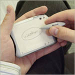 My team presented our final concept, specifications, and scenario of use (5.76mb ppt) for the Microsoft miLife project. We created a device (that could also be just a software platform) that combines the always-on, flexible nature of post-it notes with the intelligence of software. If you want to know what I've been up to for the last three months, this is it. My team presented our final concept, specifications, and scenario of use (5.76mb ppt) for the Microsoft miLife project. We created a device (that could also be just a software platform) that combines the always-on, flexible nature of post-it notes with the intelligence of software. If you want to know what I've been up to for the last three months, this is it.
What you won't see in the PowerPoint is the 1.5 minute movie we shot as a sort of "commercial" for the device over the last two weeks. Unfortunately, it's way too big to post in its current, high-quality DVD state, but I'll see what I can do to post it later. I can't tell you what a relief it is to have finished this project. It was a great project, but the workload, combined with three other classes, was pretty intense. Kudos to my teammates Jennifer Anderson, Chun-Yi Chen, and especially Phi-Hong Ha for putting up with me and for making my concept really come alive.
posted at 09:42 AM in
classmates, projects
| comments (4)
| trackback (0)
| link
Sunday, May 2, 2004
Certificate of Non-Compliance
A certificate of non-compliance is something of an inside joke, passed down from the second-years. They are "issued" by other students to students or teams who are clearly going way overboard on an assignment. My miLife project team is about to be issued one for our final presentation for Microsoft on Wednesday. We had a photoshoot on Thursday and two filming sessions with a cameraman over the last few days, putting together a little movie and a long scenario with stills. Definitely non-compliant.
posted at 04:23 PM in
projects
| comments (0)
| trackback (0)
| link
Monday, April 26, 2004
SeeNote
We presented the results of our product testing and the refined version of our SeeNote concept (7.1mb ppt) for the Microsoft-sponsored miLife project last week.Design Studio II, the class that this project is run through, is basically like a job. I spend some 30 hours a week, outside of class time, working with my team on this project. It's the most time-intensive class I've taken (or hope to take), although Interface and Interaction Design was close. It's a killer.
posted at 04:32 PM in
classes, projects
| comments (0)
| trackback (0)
| link
Wednesday, March 31, 2004
miLife Personas and Product Concepts
We presented the results of our generative research to Microsoft on Monday for the a set of personas (156k pdf) and our research findings and product concepts (550k pdf). We also created an extensive set of storyboards for each concept, walking through a scenario of use. I'll try to remember to scan some in.In any case, we now have three weeks to refine the chosen concept (concept #1: SeeNote). Which means more scenarios, schematics, task flows, a paper prototype, testing, a physical model, a digital prototype, and a presentation to put together. In three weeks. It's a good thing I don't have other classes. Oh wait... UPDATE: MS changed the concept they wanted us to pursue. Now it's #2, SpeakEasy, the headset device.
posted at 08:22 AM in
projects
| comments (1)
| trackback (0)
| link
Tuesday, March 30, 2004
Ugly Poster Prototype
I'm still slowly circling around my final project for Mapping & Diagramming. I did an earlier iteration with just post-it notes, but I wanted to try something with some actual album cover images. Thus, this ugly poster prototype (190k pdf) that looks like a plate of spaghetti with album cover meatballs. Ugly as it is, it's still useful and sort of interesting.
posted at 02:34 PM in
projects
| comments (0)
| trackback (0)
| link
Wednesday, March 17, 2004
miLife Generative Research
I've made my feelings about generative research known before, but nonetheless, for the good of the miLife project, I went and led a session of collaging. This was after the participants had spent several days doing a photo diary and reflecting on how they capture and use information. Here's some pictures from the session.
posted at 12:13 AM in
projects
| comments (0)
| trackback (0)
| link
Tuesday, March 16, 2004
Music Map Prototype
 I finally started on my final project for Mapping and Diagramming. On Karen's good advice, I did a test run with sample data from Amazon and a bunch of post-it notes. Clearly, I am going to have to do the same thing with the actual data when I do this for real a week or two from now. It's really the only way to easily move stuff around. I finally started on my final project for Mapping and Diagramming. On Karen's good advice, I did a test run with sample data from Amazon and a bunch of post-it notes. Clearly, I am going to have to do the same thing with the actual data when I do this for real a week or two from now. It's really the only way to easily move stuff around.If CMU has taught me anything, it's that you should seldom start with a computer when designing; paper, white boards, and post-it notes are often the way to go. View the prototype.
posted at 10:49 PM in
projects
| comments (4)
| trackback (0)
| link
Tuesday, March 2, 2004
The Sound of America, March 2004
Inspired by the political book map, I've decided to use Amazon's data for my final project for my Mapping & Diagramming class. (Hard to believe I'm starting a final project already!)I'm planning a poster that shows the linkage between Amazon's Best Sellers using the "Customers who bought this album also bought..." data. Once I establish those links (perhaps going two or three levels of linkage deep), I can pull out some meta categories like genres and show those atop the pattern. I'm also planning to use the data for some related sidebars. Should make for an interesting diagram.
posted at 08:59 PM in
projects
| comments (3)
| trackback (1)
| link
Wednesday, February 25, 2004
miLife Research PresentationWe presented our initial research findings and implications (3.4mb powerpoint) to Microsoft on Monday for our miLife project. It was a not-inconsiderable amount of work to do, both in terms of the actual research, but also in distilling the raw data we had down to summaries and then, the implications of those findings. I'm particularly pleased with the model that arose from our research of people capturing small bits of information. I think that's a neat area to be exploring and it'll drive the next two months substantially.
posted at 10:15 AM in
projects
| comments (0)
| trackback (0)
| link
Tuesday, February 10, 2004
Mapping Data to the US States
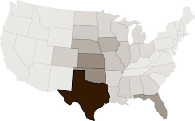
Can you guess what this map shows? Our project in Mapping & Diagramming was a map of the 48 continental US states, showing some kind of data that contained all the states to some degree. With no key and no text. If you are interested, this map displays this data.
posted at 11:51 PM in
projects
| comments (0)
| trackback (0)
| link
Saturday, February 7, 2004
miLife User Research
Aside from observing in malls, ski lodges, coffee shops, and other public spaces, my team has created an online questionnaire. If you have ten minutes to spare and are over the age of 18, please help us out by filling it out.
posted at 04:29 PM in
projects
| comments (0)
| trackback (0)
| link
Tuesday, February 3, 2004
Home-CMU Map
Our second project for Mapping & Diagramming class was to make a map for this scenario: an old friend is in town and wants to get from your house to the M&D classroom.My first solution was a hand-drawn map with some instructions, but after everyone else busted out Illustrator and InDesign, I broke down too and made my final map (pdf 40k). For a comparison in styles, you can check out Rob's map too.
posted at 11:31 PM in
projects
| comments (0)
| trackback (0)
| link
Saturday, January 31, 2004
miLife Extranet Launched
In order to keep Microsoft abreast of our activities on the miLife project, our newly-named team, Team XXXy (named to reflect our three women+one man composition), launched an extranet to post status reports, deliverables, etc.
posted at 11:26 PM in
projects
| comments (0)
| trackback (0)
| link
Wednesday, January 28, 2004
Small Map Redesign Project
Rob has done a good job with an overview of our Mapping & Diagramming class, so I'll just proceed on to talking about our first project.Back in 1995, CMU's Design building, Margaret Morrison Carnegie Hall (known simply as Margaret Morrison or MM here) had an exit closed for a few weeks during summer. CMU maintenance put up this map: 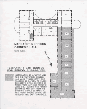
Our class found roughly 30 things wrong with its design, some of which are pretty obvious, some not so. Stuff like the North on the directional arrow looks like a Z, for instance. Considering how complicated the map is compared to the information it wants to convey, it's pretty bad. My solution (pdf 24k) is a lot simpler: almost too simple, some would argue. But I think it's a hell of a lot clearer.
posted at 05:05 PM in
projects
| comments (0)
| trackback (0)
| link
Monday, January 26, 2004
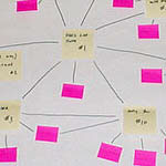
miLife Concept Map
One of the initial deliverables for our Microsoft miLife project is a concept map of what our team feels are the big themes for the project. Those themes then, suggest areas of investigation for user research, which, in turn, suggest areas of opportunity for products. But first, there's the concept map (260k Flash), which, for fun (plus 40 hours of work), I made interactive. Enjoy.
posted at 09:03 PM in
projects
| comments (0)
| trackback (0)
| link
Thursday, January 15, 2004
miLife Project Kick-Off
My team for our semester-long project for Microsoft consists of me, Hong, CPIDer Jennifer Anderson, and Chun-Yi Chen. I think it's a pretty solid team and we should do well on this project.We had our "kick-off meeting" (as we used to call them in my agency days) with the client, in the form of a conference call with Michael Lenahan, User Experience Manager in the Mobile PC Group, to get more details about the project. As it turns out, the project constraints are fairly minimal. It should be a mobile device, preferably in the "thin and light" or "ultra-mobile PC (UMPC)" range, which means a 4-14" display, 2-4lbs, and connection via wifi. The design that we come up with should be able to be executed within the next three-five years. It must build on users' needs to be mobile throughout the day, yet be more than just a transportable device. It should work on a Windows platform, but there's no MS constraints on style. In fact, it's supposed to be "a product [that users would think] would never come out of Microsoft." The hardware form should be "personal and relevant." We were shown a marketing piece for MS Media Center as an example of the type of "casual, lifestyle" products they were interested in having us create. There's no set target audience. It's very wide open. We have a lot of work to do.
posted at 09:14 AM in
projects
| comments (0)
| trackback (0)
| link
Monday, January 12, 2004
miLife
Grad Design Studio II started off with a bang: the formal (although it's been an open secret for weeks) announcement that we're doing a project with a little company called Microsoft this semester. It's one big project for the whole semester, revolving around a MS initiative called miLife (not to be confused with Apple's iLife suite). Apparently, although we're going to find out more on Wednesday during a conference call with 'the client," it involves Microsoft wanting to move into more non-office (and non-Office-) spaces. miLife is about "Realizing the benefits of the personal computer through hardware and software integration." Whatever that means.On Wednesday, we'll find out who is on our in-house team, which is important because you are stuck with them for the whole semester. The team will work through a version of Alan Cooper's design process towards a final product, which MS may or may not go forward with. Should be interesting.
posted at 08:18 PM in
projects
| comments (0)
| trackback (0)
| link
Wednesday, December 10, 2003
Echo
Jeff has posted a revised version of our (and Rob's) final project for Interaction and Interface Design class on rich emotional communication. Echo is a little desktop toy with a webcam inside it. As you IM, it watches your emotional state via facial expressions, gestures, and the text you type, and reflects (echoes) your emotions back at you and to designated users on your Buddy list.
posted at 08:02 PM in
projects
| comments (0)
| trackback (0)
| link
Wednesday, December 3, 2003
Blue Slide
My final project for Design Studio's Unconscious Competence Project (which also happens to be my final project for my Computing in Design class) is finished. All ActionScript, all the time! Blue Sliding (570k Flash).
posted at 05:21 PM in
projects
| comments (0)
| trackback (0)
| link
Monday, November 17, 2003
End of Fall Semester '03 Work
By my reckoning, I have the following due in the next three weeks:- A paper for Seminar, in which I am supposed to have an idea what my Master's thesis will be about.
- A new project for interface class: Rich Emotional Communication, based off the the work done by the Project on People and Robots. Basically, create an emotional communication device.
- The final piece for the Unconscious Competence project.
- A revised (shortened) version of the Illegibility project (and an accompanying process book).
- A Flash presentation system for my Computing in Design class.
I am going to be seriously busy.
posted at 11:28 PM in
projects
| comments (0)
| trackback (0)
| link
Friday, November 7, 2003
Robot Walker Design
Even though we're supposed to be doing another round of user testing and refinement on this project next week, I'm happy enough with what we presented on Tuesday (200k Flash) to show it to you now.For another look at this project and a solution, check out Rob's blog.
posted at 12:07 AM in
projects
| trackback (0)
| link
Tuesday, November 4, 2003
Flash Art Project
Another little project ended today for my Computing in Design class. I wrote a little program in Actionscript to make this fun, useless set of moving circles (2k (!) Flash SWF). Fun for the whole family. If the whole family smokes a lot of pot.
posted at 10:28 PM in
projects, software
| comments (0)
| trackback (0)
| link
Unconscious Competence ProjectOur information visualization project mainly over (although we have a final final presentation in three weeks), we've moved on to a new project in Design Studio class, and a new instructor: Shelley Evenson, who is taking over for Dan Boyarski for the rest of the semester. She's also teaching Design Seminar II, which I (and the other first-year design grad students) have to take next semester. The new project involves finding an activity that someone is "unconsciously competent" at, then documenting the processes around that activity. The purpose is to sharpen our research skills and train us to look carefully at a process and document it. And in documenting, to spark design ideas. Now I just need to pick an activity...
posted at 01:47 AM in
projects
| comments (1)
| trackback (0)
| link
Wednesday, October 29, 2003
Illegibility ProjectAfter many, many, many hours of work, my visualizing information space project is finished. My object to visualize, the book Illegibility by Peter Bilak (who, by the way, urged me to do another project when I contacted him via email), has more of an aesthetic and emotional space than a deep information space, so my final movie (large set of Flash files) reflects that.
posted at 10:38 PM in
projects
| comments (1)
| trackback (0)
| link
Sunday, October 26, 2003
Walker, (Texas) RobotBefore he jetted off to New Zealand for a conference, Andy did some user testing on the paper prototype (pdf 619k) we did for the robot walker project. There were some minor tweaks and some interesting things noted (as there always are in user tests--what seems so clear to you is often so not to users...). Based on those, I need to revise the wireframes (pdf 176k), and then Jeff and I need to get cracking on visuals. After Wednesday, though, since I'm still cranking out my Studio project, a seven-part, five-minute Flash movie series.
posted at 11:09 PM in
projects
| comments (1)
| trackback (0)
| link
Wednesday, October 22, 2003
Do The MathI worked for about two hours today on my Illegibility project for Studio. I completed one page of about a thirty page book I'm supposed to visualize and digitize. Two hours/page x 30 pages=60 hours of work left to do between now and next Thursday. Ouch.
posted at 07:54 PM in
projects
| comments (0)
| trackback (0)
| link
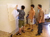
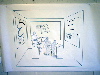
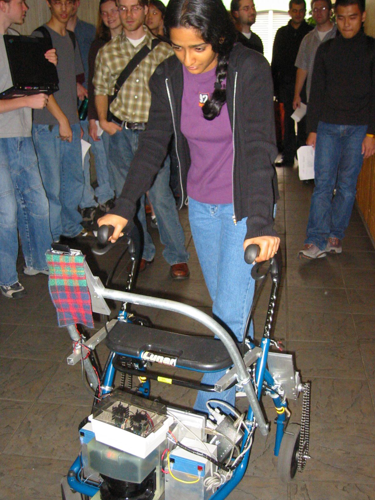
Robot Walker Project UpdateOur project team of Andy Ko, Jeff Howard and me has been hashing out our social robotic walker interface over the last two weeks. Kerry Bodine helpfully provided some pictures of the walker and its interface in its current state. Click on any image for the full size: 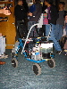  
After figuring out the target users (pdf 116k), we put together some personae (pdf 112k) and ran them through scenarios (pdf 116k). We did some research on the vision of the elderly and figured out what that meant for our typefaces (HUGE: 48pt Frutiger 55). That, combined with the screen size (1024x768, 10" screen) we were given, we generated a set of wireframes (pdf 176k). The next steps are doing a paper prototype test with a version of the wireframes, then starting to work on visual designs. And then a flash prototype. Whew.
posted at 07:45 PM in
projects
| comments (0)
| trackback (0)
| link
Sunday, October 19, 2003
Illegibility Rough CutI'm working on my visualizing information space project for Studio these days, which mainly consists of me wrestling with Flash to get it to perform like After Effects. Last week, I presented (along with everyone else in the class) a small part of the project (485k swf). It got a good response, but I am not very happy with it. The music is wrong, the timing stinks, and the visuals aren't so hot either. And this is one small part of a multi-part series of movies. Due in about a week and a half, I have a lot of work to do.
posted at 10:43 PM in
projects
| comments (0)
| trackback (0)
| link
Thursday, October 9, 2003
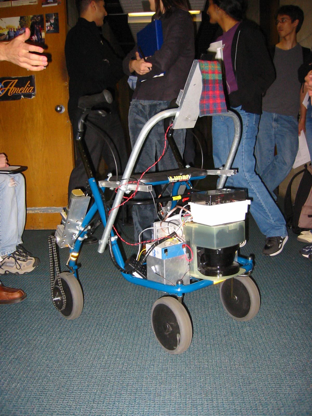
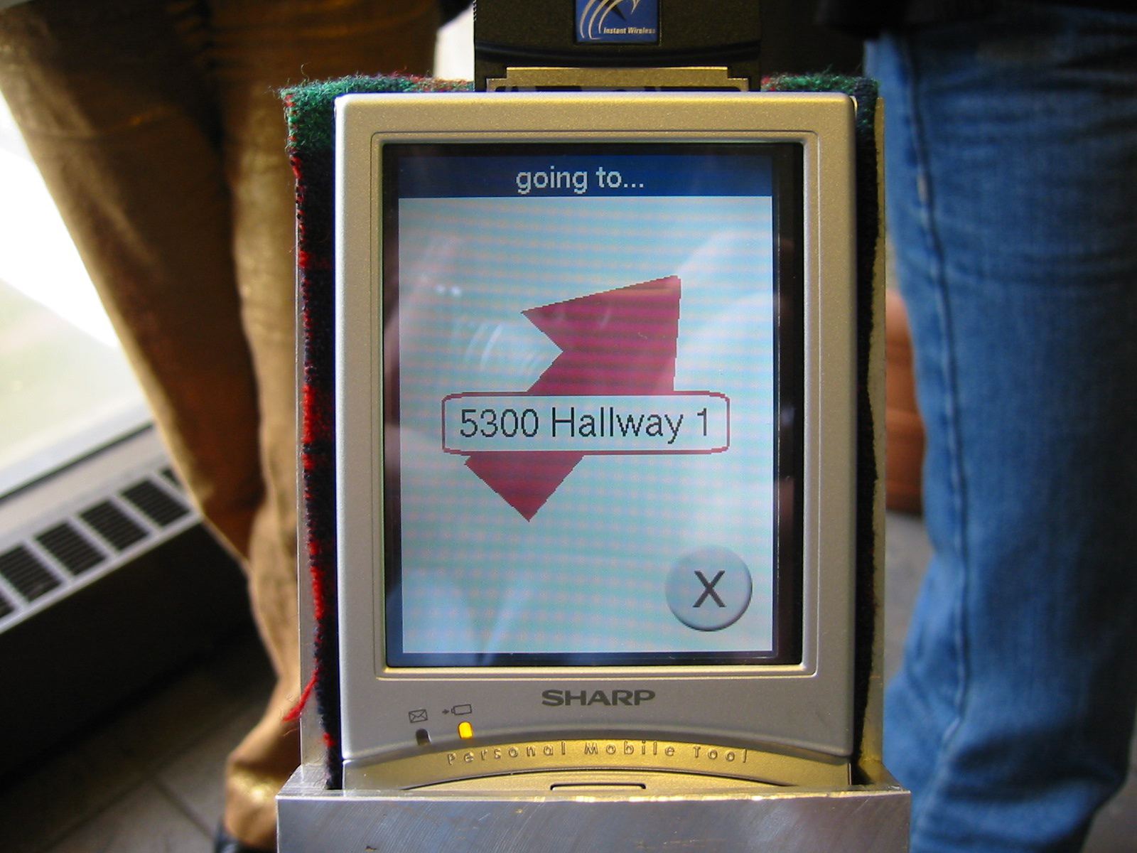
Social Robotic Walker InterfaceOur new project for interface class involves creating a touch-screen interface for a robotic walker to help the elderly get around. Yes, a robot. Pretty cool. CMU is known for its robots and the robotics institute, so it is neat we get to work with this one. Although the pictures in the pdf on that page aren't current. It looks a lot more like this now, only with a bunch of sensing equipment, a powerbook, and a battery in the basket, a bicycle chain running around one back wheel, and a handheld device strapped to the top frame. (It's a prototype after all.) The robot knows where you are and can guide you to various destinations you've entered into it. (Good for Alzheimer's patients.) It can also be sent away and recalled (for when you don't need it, like while eating or sleeping.) The interface needs some refinement, which is where we come in.
posted at 10:40 PM in
projects
| comments (0)
| trackback (0)
| link
Thursday, October 2, 2003
BreakAway: The MovieIf you're in the mood to watch a four-minute product movie for a product that doesn't exist, my movie (9.6mb quicktime) for the BreakAway project might be right up your alley.
posted at 08:02 AM in
projects
| comments (0)
| trackback (0)
| link
Tuesday, September 30, 2003
BreakAwayI realize, looking over this last week's entries, that it might seem like I spend most of my time reading articles for Seminar. While I do spend a lot of time doing that, lately the bulk of my time has been spent on projects, specifically a product for interface class we're calling BreakAway. The product is basically a reminder system that monitors email, calendar, and computer activity, and tells you in a situationally appropriate way that it is time to take a break. The product also looks like a blob of PlayDough sitting in a candle holder. At least, that's what the prototype looks like. We spent Saturday filming an instructional movie, and I've spent quite a few hours since then editing the film and adding music, titles, and subtitles to the footage. I've had to learn iMovie to do this, which added to the time it took. We're presenting the product on Thursday with the movie and a presentation about our design process.
posted at 11:49 PM in
projects
| comments (0)
| trackback (0)
| link
Tuesday, September 23, 2003
Situationally Appropriate InteractionsThe other project that is occupying my mind is the new one for interface design class: creating a timekeeping interface that retrieves, generates, and delivers information in a manner that is sensitive to the situation of the user. We're creating up to three interfaces: one that can be interpreted at a glance, one that users can understand without using vision, and one that users can understand without using vision or hearing. It can be done in one interface if we want. To that end, I've been plowing through readings on calm technology and ambient displays of information. I've also been brainstorming about time and possible applications with my two teammates from the HCI department, Angela Wagner and Irina Shklovski. We've decided to focus on breaks and design some objects that help remind you to take a break. We're thinking of them as healthy smoke breaks, or coffee breaks, and have been doing a lot of contextual research on the benefits of breaks (microbreaks and micropauses) and similar products. We have two weeks left to finish this project.
posted at 10:16 AM in
interface design, projects
| comments (1)
| trackback (0)
| link
Visualizing Information SpaceThe self-portrait project done with, we've moved on to another project for Design Studio: taking an information-rich object and re-imagining it in digital space. We were assigned the object, which could be anything from the New York Times Sunday paper, to magazines, to websites. My object is a typography book on illegibility by Slovakian type designer Peter Bilak. It's an interesting book, but I have no idea yet how I'm going to re-envision it. A kinetic typography piece? A website? I have a month to figure it out.
posted at 09:50 AM in
info design, projects, visualization
| comments (0)
| trackback (0)
| link
Tuesday, September 16, 2003
Scheduling ProjectI turned in another project for Interface class today. We were supposed to design something that would let us schedule an appointment, cancel that appointment, and alert us when we've scheduled two appointments at once. We were supposed to use the mood boards and taxonomy of mechanical objects we did earlier for inspiration. I focused on the Hearing mood board and made a programmable headphones (793k power point) that make different noises for different things. An auditory interface. I don't yet have a picture of the 3D model I made of the headphones yet.
posted at 10:44 PM in
projects
| comments (0)
| trackback (0)
| link
Friday, September 12, 2003
Self PortraitI've spent the bulk of the last few days working on a self-portrait poster (pdf 1.8mb) for Design Studio. It's been a challenge because I haven't done much print work, nor have I do a lot of product photography, which my concept required. I took a look at myself by looking at the contents of the bag I carry around. So I took pictures of the bag and its contents in a makeshift studio in my study, then spent hours photoshopping them until they looked sort of right. Then this afternoon, I sent it off to the Design School printer. It's 3'x1', so it wouldn't print on anything less than something pretty big. Another project done. Whew.
posted at 08:55 PM in
projects
| comments (2)
| trackback (0)
| link
Tuesday, September 9, 2003
Mood BoardsFor the last few days I've been working bitchingly hard on a set of mood boards (3.8mb pdf) for Interface class. I turned them in today and it was a relief. What you won't see in the pdf is how they were physically constructed, with a transparent overlay on top of the images, with the name of the artist and work, plus some commentary about why I chose the image. They aren't mood boards in a traditional sense. More of a visual exploration of a set of words that can then be used as source material for our other projects in the class.
posted at 08:29 PM in
projects
| comments (2)
| trackback (0)
| link
Tuesday, August 26, 2003
So it begins IIToday I started two more classes: Computing in Design and Interaction and Visual Interface. Computing in Design used to be Intro to Programming for Designers, where they taught the design students the basics of Java. So many students complained about it that this year instead the focus is on Actionscript, the coding language used by Flash. Of course, the day we start class is the day after Macromedia announces a new version of Flash. Oh well. And I just bought my copy like two months ago too. Grrr... In any case, the class uses Actionscript as a basis to teach us the basics of object-oriented programming while providing us with a tool we'll actually use in other classes and in professional practice. It's being taught by Ian Hargraves, a second-year interaction design student and TAed by Jeff Howard, one of the first-year ID students. Chances are, I won't be writing overmuch about this class, since, while useful, probably a good portion of what I'm learning about can be learned elsewhere. My other class was Interaction and Visual Interface Design, taught by professor Jodi Forlizzi. This class is going to be very project-based, with four longer projects and several one-day ones thrown in as "quizzes." We talked about three trends in design over the last 50 years: a systematic way of breaking down design problems (human factors and HCI), then having users design (participatory design), and the most recent, a combination of user and a designer's knowledge. What is interface design? Interfaces are the "skin between the product and the world it exists in." The skin can be a digital image or it can be an environment, like the inside of Starbuck's, or a physical set of controls like the dashboard of a car. Interfaces offer the user a "story of use." That is: here's how to experience/use me. We then launched right into our first project: Expression and Physical Interaction. We're going to be looking at physical objects (like, say, an egg beater) and create from them a list of rich interactions that could be applied to a digital context. Then we're going to apply them to a simple scheduling application. First, though, we're creating mood boards made of images based around various words: vision, hearing, touch, place, pose, movement, and facial expression. We'll use these throughout the course as a sort of pallete to refer to. Homework tonight: working on my Studio and Seminar homeworks for class tomorrow. So it begins. My life isn't my own any more.
posted at 10:26 PM in
big ideas, classes, classmates, faculty, interface design, projects, software
| comments (1)
| trackback (0)
| link
Monday, August 25, 2003
So it beginsToday was the first day of fall semester and, really, the first day of school. Yes, I did CDF in summer session, but today seemed so much more real somehow. Maybe it was that all my classmates were around. Maybe it was the several thousand undergraduates that appeared on campus. And maybe it was just that both professors talked about the experience of CMU and about being in graduate school. Whatever it was, it was an exciting, nerve-wracking day. My first class was Design Seminar I, which is taught by the former head of the design department, Dick Buchanan. It's a rather infamous class, much talked about by alumni and the second-year grad students. And, three minutes into the class, it's not hard to see why. "I'm here," Dick introduced himself, "to change design in the world. I want to change the way design is taught and practiced." Then he turned to my classmate Jennifer Anderson. "Why are you here?" he bluntly asked. Then he went around the room, asking each person in turn. (My answer, in case you care, was that I want to make the world a better place by improving the tools we use.) That done, he talked about the difference between undergraduate and graduate study. Graduate study focuses on themes, connecting (and mastering) a set of facts to create an approach to design practice. Graduate students are expected to become leaders of the industry, able not only to create good designs ("good" being defined by Dick as "well-designed and the right thing to do"), but also to discourse on them. Master's students aren't expected in their theses to contribute something new to the design field, but rather to deepen a theme. It is the doctoral students who are more concerned with inquiry into new design areas and research. Interaction is at the heart of all of CMU's Masters of Design programs, even the new one in Product Development. Something he's obviously going to get into more is that interaction design relates to Poetics (creating emotionally satisfying experiences), while CPID relates to Rhetoric (creating persuasive products). I'd be lying if I told you I knew what that meant right now. The stated goals of the class: - establish a common framework of the concepts of interaction design
- provide a strategic perspective on the community of practice
- find our place in the field of practice
- encourage creativity
Grad students, Dick informed us, can be boring to teach. We have too many things built up inside us that we need to suspend in order to learn. We need to learn how to be inventive. Dick's main goal is "to provide [you with] enough stuff so that you see the world differently."It's ok, he told us, if this is perplexing. Perplexity is a form of wonder. And when wonder occurs, the possibility for creativity emerges. We then discussed the History of Design and the History of Interaction. In the 20th century, there were two great fields of design, graphic (symbols) and industrial (objects). About 40 years ago, the language of design began to change and it started to talk about human systems like environments (actions). Then, recently, design has concerned itself with what holds a system together (thought). These are the Four Orders of Design: symbol, thing, action, thought. New things can happen when you think of something outside its order. For example, a table. A table is not a thing. Think about it as a symbol or an action. ("Ceci n'est pas une pipe"?). I'm guessing we'll get a lot deeper into this as well. Finally, we looked at the following fragment: Interaction is a relationship between in the process of for the purpose of Broken down, this becomes a series of questions: - What is the data we have? What do we look for? What is acceptable data and how do we interpret it?
- What is it between?
- How is the connection established?
- Why? What is its purpose?
And that's where we left off. We have a homework assignment to select any example of interaction design and identify at least three types of data that one could investigate in order to understand or appreciate the design.Reminder: this is all in the first hour and a half of fall semester. Went to the on-campus Indian restaurant with Rob and Phi-Hong Ha, another first-year interaction design student. I like Sree's Indian food from the trucks better, I found. The afternoon class was Graduate Studio, taught by the current head of the design department, Dan Boyarski. Studio is the yin to Seminar's yang. Seminar is mainly reading and discourse. Studio is project based and more nuts-and-bolts. Dan started by saying that if the faculty don't change us, don't make us students different than what we were before we came, they haven't done their jobs. Grad school can be thought of as a retreat. It's not a smooth journey, however. We talked about the need to be flexible: the environment we're working in is constantly changing. Often, part of the designer's job is simply to exercise common sense with clients. Communication is what interaction is. We work with human-to-human communication, filtered through mediums (like computers). It's our job to turn data into meaningful information by providing form and structure to it. We looked at Richard Saul Wurman's ways to organize data: LATCH. Location, alphabetical, time, category, hierachy. One of my classmates, Cheryl Gach, suggested one more: Random. Combining these ways, the information becomes even more meaningful. It's the designer's job to ask the right questions of the data. Our first project for Studio is a self-portrait poster using Wurman's categories as the starting point. Wow, quite a day. It took me an hour and half to get it all down. I can't promise detail like this every day, but today, being the first day, I thought it was special enough to record in detail.
posted at 10:18 PM in
big ideas, classes, classmates, cmu, cpid program, design 101, faculty, projects
| comments (0)
| trackback (0)
| link
Wednesday, August 6, 2003
The Last 10 PercentIt's said the last 10 percent of a project are the hardest. Slogging through the last 3 days of this 30 (school) day course, I feel the wisdom of that remark. I'm just having a hard time motivating myself to work on the final project. (This blog is great for procrastinating!) The multiple-personality-disorder aspect of CDF is starting to get to me. This week, this! Next week, that! It's kind of tiring after a while. We're all working on our process books too, now, so that's an added thing on top of finishing the USPS form. Our process books are basically a binder filled with printouts of all the work we've done over the past six weeks. It sounds simple until you realize that half the work has been caught on digital camera and needs to make it onto a sheet of paper, printed in color, stuffed into a plastic sleeve, then put in some sort of reasonable order. It's time-consuming, although it is nice to have once you are done with it. It's a nice document of what you've done with your life. Kind of like a blog. :)
posted at 07:31 PM in
projects
| comments (0)
| trackback (0)
| link
Monday, August 4, 2003
Information DesignThis, our final week of CDF, is about information design, and is being taught by Bob Swinehart, soon to be the president of the International Institute for Information Design. [Ed. note: Maybe he can do something about the lousy information (and visual) design of their web site.]
Finally a topic I know something about! (Although, I am in school ostensibly to learn stuff I don't know.) This week, like last week, is all based on completing a week-long project, in this case, redesigning the #2 form in America: the USPS Change of Address Form: 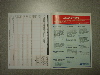
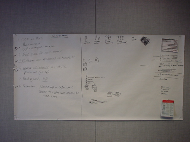
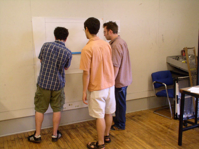
We broke into groups of three (randomly done so as to mix up the designers amidst the HCI folks), for two days of analysis and group discussions of the exisiting form and the user research that Bob and his researchers have collected about the form over the last year. I'm teamed with HCI master's student Rob and English master's student Sue for this analysis section. Each group is posting their "results" up on big sheets of paper like so: 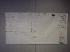
After today and tomorrow, we head to InDesign to create prototypes of the new forms.
posted at 09:39 PM in
classmates, info design, projects
| comments (0)
| trackback (0)
| link
Monday, July 28, 2003
Forms in SpaceThis week's instructor is Craig Vogel, Director of Graduate Studies here in the college of fine arts and former president of IDSA. We're learning about 3D objects: how to create and manipulate forms in space. To that end, we're working on one individual project that stretches the week. It's some kind of small sculpture built out of foamcore and paper. We don't know what it is we're building yet, except that some of the pieces are taken from measurements we did of each other's bodies today. Neema got the pleasure of measuring yours truly. But today's class was a pretty high-level overview of some of the theories, people, and processes of industrial design. We examined two cars, the Aztek and the PT Cruiser, to see why the Cruiser worked (from a design perspective) and why the Aztek did not. Products, it turns out, can be driven from either a quantitative point of view, or from a qualitative point of view. Too often, as with the ugly Aztek, the quantitative has been the driving force. But in the new world of product design, there needs to be a shared understanding of what the engineers (the quantitatives) and the designers (qualitatives) do to create better products. The best products are the ones where all the elements of it work seamlessly together to form a gestalt. Hybrids fuse different perspectives into new gestalts. In preparation for our fieldtrip tomorrow to Fallingwater and Kentuck Knob, we talked a little about Frank Lloyd's Wright's notion of "Subliminal Mathematics," which is about using underlying, invisible math as a starting point for form. We looked at the work of notable product designers like the Eames, and Raymond Loewy. Loewy came up with the idea of MAYA: Most Advanced Yet Acceptable, which is the underlying thought behind innovative designs such as the Cruiser. We also looked at Frank Gehry's Bilbao Guggenheim as an example of qualitative design leading quantitative. Briefly noted was the influence of Japanese design on products and architecture and the Japanese notion of asymmetrical balance. We also talked about how previously, products were designed for men whose body shapes were in the 50th percentile range as far as shape, height, weight, etc. Now, products are designed with both men and women in mind, ranging down to the 1st percentile of women and up to the 95th percentile of men. If this entry seems crammed full of stuff (and I've only mentioned half the things that were tossed at us today), it's because the class was as well. As we've seen from previous weeks, it's a trail to get everything in about a topic in only a week. Tomorrow is our field trip to "one of the greatest and most sophisticated uses of space and form ever made."
posted at 09:08 PM in
big ideas, classmates, design 101, faculty, projects
| comments (0)
| trackback (0)
| link
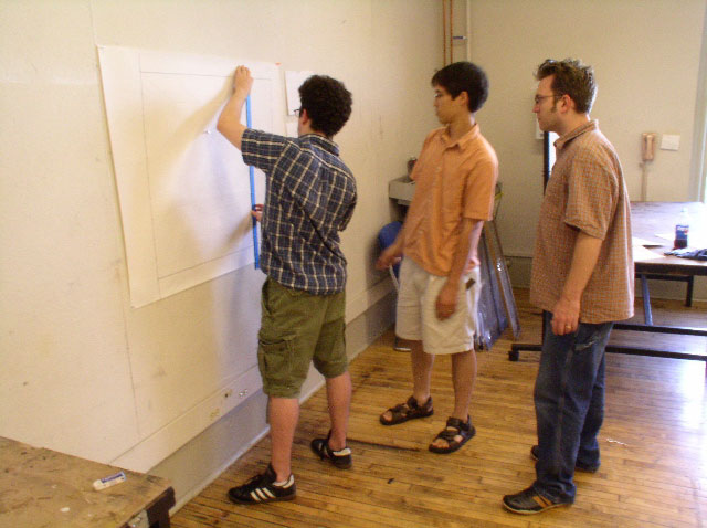
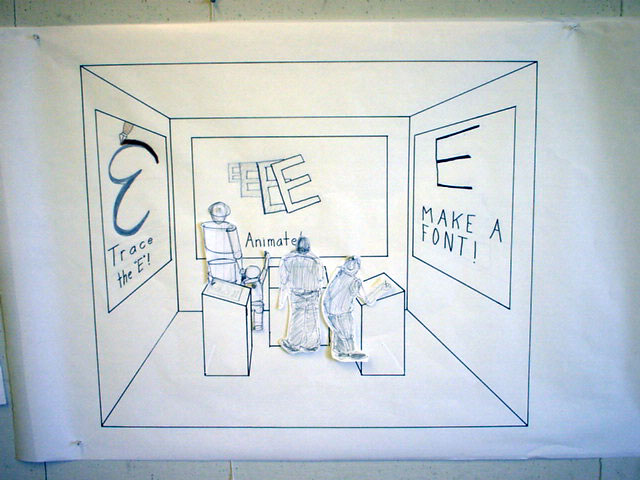
Perspective Drawing ImagesAs promised, some images of me and my partners Andy Ko and Matt Easterday working on our final project for Drawing...I mean, Visualization: a 3D drawing of a 10x10x12 room for an Exploratorium-style exhibit for kids on typography. (Wow, I can see the kids lining up for that one!) Click on any image for a bigger size. 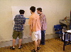
posted at 12:06 AM in
projects
| comments (0)
| trackback (0)
| link
Friday, July 18, 2003
CDF Week 3 Wrap-UpWe're halfway through CDF. My how time flies... We talked a lot about the value of critiques, and about the value of design education (for mentoring), today while critiquing our final exercise (pdf 32k). I should mention how we do critiques here (at least in this class). We post several treatments up on the wall, then proceed to go through them methodically one at a time, referring to the others on the wall as necessary. Wallspace is important for critiques. With laptops, you are limited by the number of variations you can show at one time. Wallspace removes those constraints (mostly). We also looked at the various elements that make up a type face (baseline, serifs, etc.). Strange that, similar to the photography portion of our class, in that we "play" with the things for a week before learning some of the more formal elements of the craft. I wonder if this is deliberate or not. Picking a type face for a project is a matter of readability, flavor, and context. Different type foundries have different versions of the same type face. Very few type faces are designed solely for the screen. A nugget of design wisdom: Style is something you build all your life. Next week: Visualization!
posted at 12:06 PM in
big ideas, classes, design 101, projects, typography
| comments (0)
| trackback (0)
| link
Wednesday, July 16, 2003
GesturesWe talked a lot today about composition, the placement of things on a page. Gestures--making broad strokes on a blank page--can help explore the feeling you are trying to capture in type and the placement of your text. Is the movement organic? Mechanical? Loose? Tight? etc. And don't put everything center. Centering is easy. Finding how far off-center you can go, how far towards the edges, is more interesting. Don't be afraid of the edges. But be careful of the ragged right edge of text. Make sure the edges aren't too ragged. You don't want to draw too much attention to that edge for the reader. When designing, don't throw away your early ideas. They might be cliche, but they might also be the most honest response to the problem. An underlying grid structure can help organize your page, and can also help build variety within consistant pages. It's sometimes hard to know when you are done with a project. The end is often simply determined by external forces (ie. a deadline). During the second half of class, we looked at the work of Bradbury Thompson, an American graphic designer who "helped give definition to graphic design" in the US in the second half of the 20th century. His main contribution was the integration of type and image in advertising and in his "Inspirations" projects for paper manufacturer Westvaco.
posted at 07:53 PM in
big ideas, design 101, projects, techniques, typography
| comments (0)
| trackback (0)
| link
Monday, July 14, 2003
Expressive TypographyWeek three of Communication Design Fundamentals is being taught by Dan Boyarski, who is also happens to be the new head of the School of Design. The topic is expressive typography: using the characteristics of type to convey emotion, not strictly information (as we studied in week one. We began by talking about information, however, and we were presented with the following formula: data+structure/form=information Data floats around randomly, "like dust." Only when form and structure are added, does it become useful. Information is presented in three ways: 2-D (paper, screen), 3-D (spaces), and 4-D (sequences). Paper has shaped how we organize information, but this is now being challenged by the digital environment. The history of design is really the history of materials. As materials changed, so did design. When setting a text in type, one method of getting a feeling for it is to speak it aloud. Reflecting the inflections and pauses is one thing that type can do. It's also important when choosing a typeface to think about how the text is going to be read. If it is a book, say, you need to keep the readability of the type in mind. Less contrast with in a type style is easier to read (Garamond is easier to read than Bodini, for example). Our first assignment is to set an assigned quote in 10pt. Frutiger (one weight only) in a 7" square, horizontal type only. In at least 10 variations. Strangely enough, my quote is from the Tao Te Ching, a book I have sitting on my desk beside all my design books. The passage I have to set begins, "A great square has no corners." But just before that is a passage I am thinking about now, here in school: The Way's brightness looks like darkness;
Advancing on the Way feels like retreating;
the plain Way seems like hard going.
posted at 08:37 PM in
design 101, faculty, projects, techniques, typography
| comments (0)
| trackback (0)
| link
Thursday, July 10, 2003
Text and ImageOur final assignment for this week of photography is an image that either incorporates or resides alongside a piece of text. I've spent a good portion of the last two days trying to find words attached to images: graffiti, signs, bumper stickers, t-shirts, posters, you name it. I could have taken a picture and written a caption, but after looking at Lee Friedlander's Letters From the People in class yesterday, I was interested to see what I could find in the world. If I could find text that provides a commentary or perspective on the image it resided in. So I've been hunting. I found several very cool signs ("We will not wash laundry with vomit on it") but it was tricky to get the picture to work with the text. All in all, I took about 100 pictures (thank god for digital cameras) and then played around with about 10 of those until deciding on the one I'm most happy with (pdf 344k). We've talked a lot in class about photographic intent: what the photographer wants to convey via the photograph. Sometimes, like in advertising, this means selling product, or presenting product in a desireable way. Sometimes it is to convey a feeling or a message. It helps to have what Charlee calls "formal skills" (ie. a command of the medium and techniques) so that you know the best ways to approach a subject, how to best present it. (Then again, when doesn't it help to have a command of your medium in doing just about anything?) Some other notes: - The real world is often dull, visually. Photographers need to find ways to make the dull exciting.
- It's hard to make a composed picture look random.
- It's hard to show relationships between objects in a picture.
- Repeating texture by itself isn't very interesting.
posted at 08:40 PM in
photography, projects, techniques
| comments (0)
| trackback (0)
| link
Wednesday, July 9, 2003
What Makes a Good ImageWe've been having a debate/discussion, both in and out of class, about what constitutes a good photograph. Or if this is a false question entirely: it can't be determined because the medium, since it contains an element of artistry, is too subjective and that context (how the picture was made, under what circumstances, and how the elements of composition work in that particular picture) is too important. Since most of us in class are novice photographers, it is often hard to tell if a photograph "works" or not, and if so, why or why not. It's difficult for many of us (me included) to critique work, so unfamiliar are we with the language of photography. But critique we did, spending most of class today going through our last assignment of photographing objects, first in representational/documentary style, then in abstract style. One thing became apparent quickly: there are a lot of talented people here. Some of the images were stunning: beautiful, grotesque, intriguing. I wish I could present some of the work here, other than just my own attempt (112k). Our next assignment is a combination of image and text: text as part of the image, or as a caption, or as commentary. My comment on learning Illustrator in software bootcamp: it's hard. It makes InDesign look like a picnic in comparison.
posted at 05:04 PM in
photography, projects
| comments (0)
| trackback (0)
| link
Monday, July 7, 2003
Introduction to PhotographyWeek Two of CDF began with a new instructor (Charlee Brodsky) and a new topic: photography. It's reportedly the first time photography has been included as part of this course and it should be an interesting subject to explore. Photography, Charlee explained, is in one sense easy to study because photographs are a part of our culture. They are used to sell things, to document news, and to document personal history. Photography is "the mind and they eye working together, with some heart thrown in." Photographs "stop time and are a sliver of space," and provide a frame through which to view what is important. A photograph shouldn't show everything however. If it does, Charlee contents, the viewer doesn't ask himself the important questions. Photography is all about light. Light reveals the subject, lets us make an image, record something. There are two main ways of representing subject matter: documentary images (which Charlee likened to nouns) and abstract images, which use surface qualities of subjects to make another kind of image. They can be likened to music in that they are more easily described as feelings. Similar subject matter can be presented in a miriad of different ways. We looked at two views of suburbia, Mark Rader's Scanscape and Bill Owens' Suburbia as an example of this. We also viewed The Best Part of Me by Wendy Ewald and Shopping by Merry Alpern for different styles in portraiture. And indeed, our first project is in portraiture, where we pair up with a partner to photograph and, in turn, be photographed. First-year CPID grad student Jenni Miehle was my partner and got to endure not only taking photos of yours truly but also my bad Austen Powers impression ("Work it baby, work it! Yeah!") as I took her picture. Here's an outtake (155k) that I'm not using as part of my "best-of" selection for class critique tomorrow. In software bootcamp, CPID alumnus Matt Mowczko is taking us through the ins and outs of Illustrator this week.
posted at 10:50 PM in
classmates, faculty, photography, projects
| comments (0)
| trackback (0)
| link
|


