« September 2004 | Main | November 2004 »
October 29, 2004
Chaos Theory for Sustainable Design
John Body, assistant commissioner for information management for the Australian Taxation Office and CMU School of Design research fellow, gave a really interesting talk on understanding design through chaos theory yesterday. I'll summarize his thoughts.
The discipline of design is changing its face because design thinking is being applied to more complex challenges, challenges with multiple intents and many stakeholders that have to deal with experiences, products and services, processes, technologies, and people. The bigger the system you are dealing with, the more design needs different tools and techniques.
There are currently several ways of working with this complexity: strategic conversation, systems thinking, systems mapping and modeling, management theory, complexity theory (systems of many agents), and what John discussed: chaos theory. Chaos theory really began in 1961 with Edward Lorenz and really took off thanks to computing. Computers could run the many simulations and iterations that chaos theory requires. It could be shown over time that small changes have large consequences to systems (the famous butterfly effect).
There are four principles of chaos theory:
- Order and Chaos. Both things are in all systems, but too much of either thing is a bad thing. You need the proper balance. Too much chaos leads to being out of control. Too much order is equally unsustainable and leads to rigidity, a lack of variety, and ultimately death. Things get more interesting as they reach the edge of chaos, because there are more states the system or object can move into. Chaos has more variety. A glass on the edge of the table is more interesting than a glass in the center of the table.
- Attractors. Attractors are things within a system around which other things, people, or activities cluster. Attractors give order and form to systems. It is much easier to work with attractors than against them.
- Fractals. Fractals are about zooming in and out, showing a macro view, then a micro view. The two views are similar, but not identical. You don't find simplicity by zooming it; there is always more depth. Too high a view is bad. So is too low.
- Non-Linear - Bifurcation. Systems are non-linear and seemingly direct paths often diverge, going in different places than what you expect. Expect the unexpected.
So what does this mean for design? Here's some lessons that came out of the discussion.
- Working at extremes, too high or too low, isn't very effective. You can either get locked into categories or else get out of control. You need to dip in and out of chaos and order.
- Sometimes a design team needs to stir things up, sometimes it needs to provide order. You need to know which one is required and use different strategies for each. If a product is too stable and at the end of its useful life, it might need to be disordered.
- In any project, define the attractors. Seek out what attractors have been missed and which have operative force. Find the relevant ones and use them. Look for attractors that offer opportunities because they are neglected. There are often unspoken attractors like values that can affect a project and put blinkers on evaluation. Formal structure in organization can be a key factor of attractors, but isn't often the primary one.
- If something is becoming more stable, that usually means it's working.
- At what level do you begin looking? You need to zoom in and out during the design process so that you can see multiple levels of the project. Zooming can break down the scope of the project. If you are too high, you get scope creep. If you are too low, you get lost in the weeds of detail.
- Encourage people to push towards instability. Non-linear shifts can lead to new innovations and inventions.
- Design for the rare 1% of the time, not just the 99% normal times. You have to design for sub-optimal environments. Not efficiency, but redundancy.
By understanding chaos theory and its implications, you can design so that the system continues to be successful, not just one product of the system. Chaos theory helps us understand how you can sustain a system over a long period of time: by getting the right balance of order and chaos, by working with attractors, by looking at multiple levels of the project, and by expecting the unexpected.
We can use chaos theory to support what we already know. But we can also use it to add something extra. In all systems, there are a whole lot of elements working randomly, but somehow all working together. Everything is interconnected, therefore unpredictable things happen.
Posted by Dan at 9:55 AM | Comments (1) | TrackBack
October 26, 2004
System Boards
We were introduced to the concept of system boards in typography last week. System boards are to print compositions as the frame is to a house: something that defines the structure, but allows for both refinement and modification.
System boards allow you to work in pure line or form, making a skeleton of the composition. You establish an identity, a formal structure, then push and pull your content within that identity. In a way, it is the separation of information from the composition, allowing you to find flow lines, a grid structure, and modular/non-modular sections. I wish I had an example to show you; they look like very simple, grid-like sketches of lines.
Posted by Dan at 3:06 PM | Comments (0) | TrackBack
October 21, 2004
Help a Fellow Out
If you are between the ages of 18 and 54, help me out once again by taking a 10-minute or less survey related to my thesis project.
If you haven't looked at my thesis project site in a while, stuff has been happening over there...
Posted by Dan at 10:40 AM | Comments (1) | TrackBack
October 20, 2004
Courting the Nerd Vote
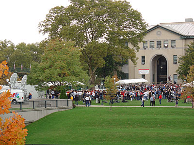
First it was VP candidate John Edwards' visit to campus a few weeks ago. Today it's the presidential candidate himself, John Kerry at a rally, accompanied by a cavalcade of B-level stars: CMU alumnus Ted Danson, Pittsburgh Steeler great Franco Harris, Liz Berlin and Jen Wertz of Rusted Root, and, as the opening act, Bon Jovi!
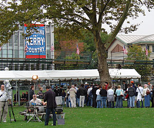
Some 10,000 people were expected, but I'm guessing it's about half that, and only a couple hundred or so get to see the actual proceedings; the rest stand around.
The campus is still a circus. Crowds chanting, secret service agents on rooftops, unctuous political operatives gladhandling each other, and news crews with their truck satellite dishes atop. It is a sight to see.
And the fun doesn't end here. Tomorrow: Condoleezza Rice! Tuesday: Michael Moore! CMU has become a swing-state stop on the campaign trail.
Posted by Dan at 5:09 PM | Comments (1) | TrackBack
Force-based Physical Simulations
In Interactive Graphics class, we've started working with particle systems, which are an alternative to time-based or implicit ways of making things move. Basically this is to better simulate organic ways of movement. A good example of this kind of animation can be found at Soda Play.
As such, we're using two natural laws to start governing movement: Newton's Law and Hooke's Law. Newton's Law is Force=Mass*Acceleration or Acceleration = Force/Mass. Hooke's Law deals with elasticity or in Processing terms, springs. Hooke's Law states that the extension of a spring (or other stretchy object) is directly proportional to the force acting on it. Written in math, this is Force = - spring constant * the displacement of the spring from its natural state. Or F=-kx. Combining the two laws gives us the equation Acceleration = -kx/mass. We're also then using dampness aka friction as a force acting against velocity.
If you have no idea what I just said, don't worry; I barely do either. (In addition to skipping Trig, I also didn't take physics in high school. You'd never guess I went to a prestigious private school, would you?) It's enough to know that we've started making animations that move more naturally, bringing physics into the inorganic vacuum that is the digital medium.
Posted by Dan at 11:41 AM | Comments (0) | TrackBack
October 19, 2004
Ways to Talk About Places
Since we're doing a mapping project in Typography, Kristin Hughes gave a lecture on ways to talk about places.
Some ways to talk about places:
- Signs as maps. Communicates spacial relationships.
- Interpretive Maps. Show ground and tactical areas. Defines places by shape, tone, pattern, repetition.
- Walkabout. Place as a rite of passage.
- Annotated Schematic Map. Gives a sense of place and orientation.
- Panoramic Perspective. Typically shows landmarks from a bird's eye view.
- Word Collage.
- Image Map. A place through pictures.
- Symbolic Diagrams. Shows abstract information like past, present, and future.
- Soundscapes. Place through sounds.
All of this is related to what Ken Hiebert calls experience mapping. Experience Mapping has several key components:
- Wayfinding. Providing directions to relevant information.
- Paths and Points. Paths are routes along points. Points are events, places, etc.
- Landmarks. Landmarks turn the generic into the specific. "Make a left at the ice cream store."
- Grid. Shows the underlying structure of a place.
- Key. Explains.
Posted by Dan at 5:02 PM | Comments (0) | TrackBack
MOM Poster
The sister project of the Unfamiliar Place poster (which I'm still working on) is, naturally, the Familiar Place poster. This time around, we're picking an area of Pittsburgh (where CMU is), then find or imagine an event that would take place in this area. The area I've chosen is South Oakland, where this year's Meeting of the Marked (MOM) is taking place. I figure a tattoo convention should provide me with some interesting visuals and typography.
Posted by Dan at 4:23 PM | Comments (0) | TrackBack
October 18, 2004
Bruce Sterling Teaching at Art Center
Wow. Writer Bruce Sterling, whom I've written about recently after his amazing SIGGRAPH keynote speech, has been asked to teach for a year at Art Center College of Design. CMU should take a cue from them and think way outside the box when it comes to picking our Nierenberg Chairs and even guest lecturers. I wonder if Sterling will teach the Future of Objects class I half-jokingly recommended?
Posted by Dan at 7:32 PM | Comments (0) | TrackBack
October 17, 2004
Navarathri
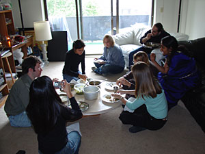 On Friday, most of the second-year students gathered at my classmate and friend Ashwini Asokan's apartment to celebrate the Indian festival of Navarathri. By celebrating, I mean eating a ton of food that Ashwini and some of her friends made especially for us and for the festival. I had to roll myself out of there.
Posted by Dan at 8:52 PM | Comments (0) | TrackBack
October 16, 2004
First Draft, First Third
I turned in the first draft of the first third of my thesis paper to my advisor Shelley Evenson yesterday. The first third is mainly on the traditional and current view of metaphor, plus the criticism of using metaphor in interaction design. The next part, the bulk of the paper, is about using metaphor in the design process. I'm hoping to have that part done in early-mid November.
Posted by Dan at 9:30 AM | Comments (0) | TrackBack
October 14, 2004
Undergrads, Beware
I've been asked to teach Interaction and Interface Design again in spring semester. I need to evaluate my class from last year , the feedback I got from students, and my own thoughts on the previous class.
Plus, now I've been in, taught, or TAed three very different classes on the fundamentals of IxD, so I should be able to better craft a syllabus and lesson plans this time around. I've also begged for a better time slot and got it: Mondays and Wednesdays 9-11. Much better than last year's Tuesday/Thursday 6:30-8:30, which was deadly in terms of energy.
Posted by Dan at 9:03 PM | Comments (3) | TrackBack
Intermorphable Alphabet
I finally finished my intermorphable alphabet (120k java applet) for my interactive graphics class. The project was to come up with a "font" in which any letter can morph into any other letter. Mine is a "block and bubbles" alphabet, composed of bubbles inside blocks that move around. I tried (unsuccessfully) to get the bubbles to break out of the blocks while moving, but I never got it to work right.
Posted by Dan at 12:51 PM | Comments (1) | TrackBack
October 11, 2004
Political Party
Hong has posted up some pictures from when we gathered to watch the first presidential debate at her apartment. Most of us were flush left.
Posted by Dan at 1:40 PM | Comments (0) | TrackBack
Obvious Observation on Thesis Paper Writing
In some ways, it's a lot easier to go to class and do projects and other homework than to sit alone in your office and write your thesis paper.
Posted by Dan at 1:31 PM | Comments (0) | TrackBack
Robert Reimann Visit
Robert Reimann, co-author of About Face 2.0 and currently the manager of User Interface Design at Bose, visited Carnegie Mellon last week for a few days, sitting in on classes and thesis meetings and giving at talk at the HCII seminar series. I got to sit in on a Q&A session and went out to lunch with and a group of interaction design students.
I jotted down some of Robert's answers to some questions that were asked by the master's students:
- What makes a good interaction designer is someone who can take inspiration from all different areas of life. It makes sense for us to cast as broad an eye as possible in finding solutions. We're synthesizers of everything. A good interaction designer is all about finding creative solutions to human problems.
- Nuance in interaction design is about reading between the lines in what you observe in research to make solutions.
- Letting users decide everything [as far as personalization/customization] is abdicating design responsibility.
- Look for places within your organization to provide design assistance. This will help forge personal relationships with people and demonstrate the usefulness of design. This is a critical part of the design role and the best designers all do it.
- If you can solve users' top two problems in a product, you are doing really well and will be ahead of most of the competition.
- Personas. Personas need to be based off actual user data. You need to use qualitative research methods to build personas. They are really a method of analyzing user data to understand usage behaviors and goals of actual people. The ability of personas to communicate outside the design team is very significant. The picture of the persona is a critical component that really makes the persona come alive. Personas by themselves aren't very useful. They are the end of the research process, but just the beginning of the design process. They only help translate needs into solutions. You need to do cognitive walkthroughs using the personas as your guides. Personas are a yardstick to use throughout the process to measure all design decisions against.
- At Cooper, they found over time that there were two different types of interaction designers: interaction designers and design communicators. The two types work well in combination.
Posted by Dan at 11:37 AM | Comments (1) | TrackBack
October 5, 2004
Reading Images
VCU professor Ben Day is here for the week with us as we work on our Unfamiliar Place poster. We're picking images to go with other text for our poster, so he gave a talk on how to read images today.
There are multiple readings of any image; its content is slippery and malleable. A rope can signify a rodeo, nautical references, a hangman, etc. You should look for what Ben calls sign indexes: what the images are pointing to. A windsock is a way of capturing the wind. A cake at a wedding isn't food, it's content signaling celebration.
Gather your images, then start labeling them. Put down the pointers: where it comes from, what could it signify, what were your assumptions when you collected it, what could it mean metaphorically. Are there any contradictions or oppositions of content? So much of good design has to do with juxtaposition, Ben told us. Find interesting juxtapositions of images: explicit vs. implicit, before and after, time and movement, linear and non-linear.
Posted by Dan at 5:52 PM | Comments (0) | TrackBack
October 4, 2004
Payback's A Bitch
In 1987, my junior year of high school, I was faced with a choice when picking my classes for senior year. I had to take some sort of math class, but I'd barely made it through Algebra II. I could have taken trigonometry my senior year. Instead, I took a class in computers. When, I probably thought to myself, am I really going to use trig? Well, now I know: interactive graphics.
The mysteries of SIN and COS have come back to haunt me as I wade through code, trying to figure out the reams of math and logic when trying to make such programs as an abstract clock, a cute rubber stamp, and our latest assignment, an intermorphable alphabet. If I ever had any myths that I could have been an excellent programmer, this class is quickly dispelling them. Each exercise, and we get several a week, takes me hours of time. My thesis work has definitely taken a hit, time-wise.
Posted by Dan at 12:02 AM | Comments (0) | TrackBack
October 3, 2004
A Place You've Never Visited
Ben Day, co-author of Typographic Design: Form and Communication and communication design professor at Virginia Commonwealth University, is visiting CMU all next week and will be working my graduate typography course. We'll be creating a poster about a place we've never visited. It can be a real or imaginary place.
The poster is supposed to be very impressionistic. That is, we're not to get images of the actual place, but instead gather images and words about the texture, smell, architecture, and culture of the place. How we imagine it to be.
I've chosen a place I've always wanted to visit but have never gotten around to it: Iceland.
Posted by Dan at 12:38 PM | Comments (0) | TrackBack