|
Thursday, October 23, 2003
Cosmic DesignWe started the fourth and final interpretation of interaction in Seminar: Ontological, or Person to Cosmos. This is a spiritual approach, focused on the human spirit/soul and its relationship to the cosmos, cosmos being an orderly whole and bigger order. We cannot know what the core of this large system is. It is a mystery, one we constantly try to solve through religion and philosophy and other means (interaction?). This interpretation is about participation, with people becoming part of the environment. We looked at Kevin Lynch's "City as Environment" as part of this approach. Lynch creates a World City by blowing up an actual city, showing it big to magnify its problems. But when he talks about big, he's also talking about small. "City" is a metaphor for wholeness. I won't pretend I understand this interpretation yet. We have another week to grasp it, so hopefully it'll come to me. Interesting to note that Dick thinks that you have no choice as to the dominant approach you take in interaction design. You can know about the others and consciously use them, but you won't naturally gravitate towards them. To be honest, I have no idea which one I use most often. I'm still thinking about it.
posted at 10:11 PM in
design theory
| comments (2)
| trackback (0)
| link
Wednesday, October 22, 2003
Do The MathI worked for about two hours today on my Illegibility project for Studio. I completed one page of about a thirty page book I'm supposed to visualize and digitize. Two hours/page x 30 pages=60 hours of work left to do between now and next Thursday. Ouch.
posted at 07:54 PM in
projects
| comments (0)
| trackback (0)
| link
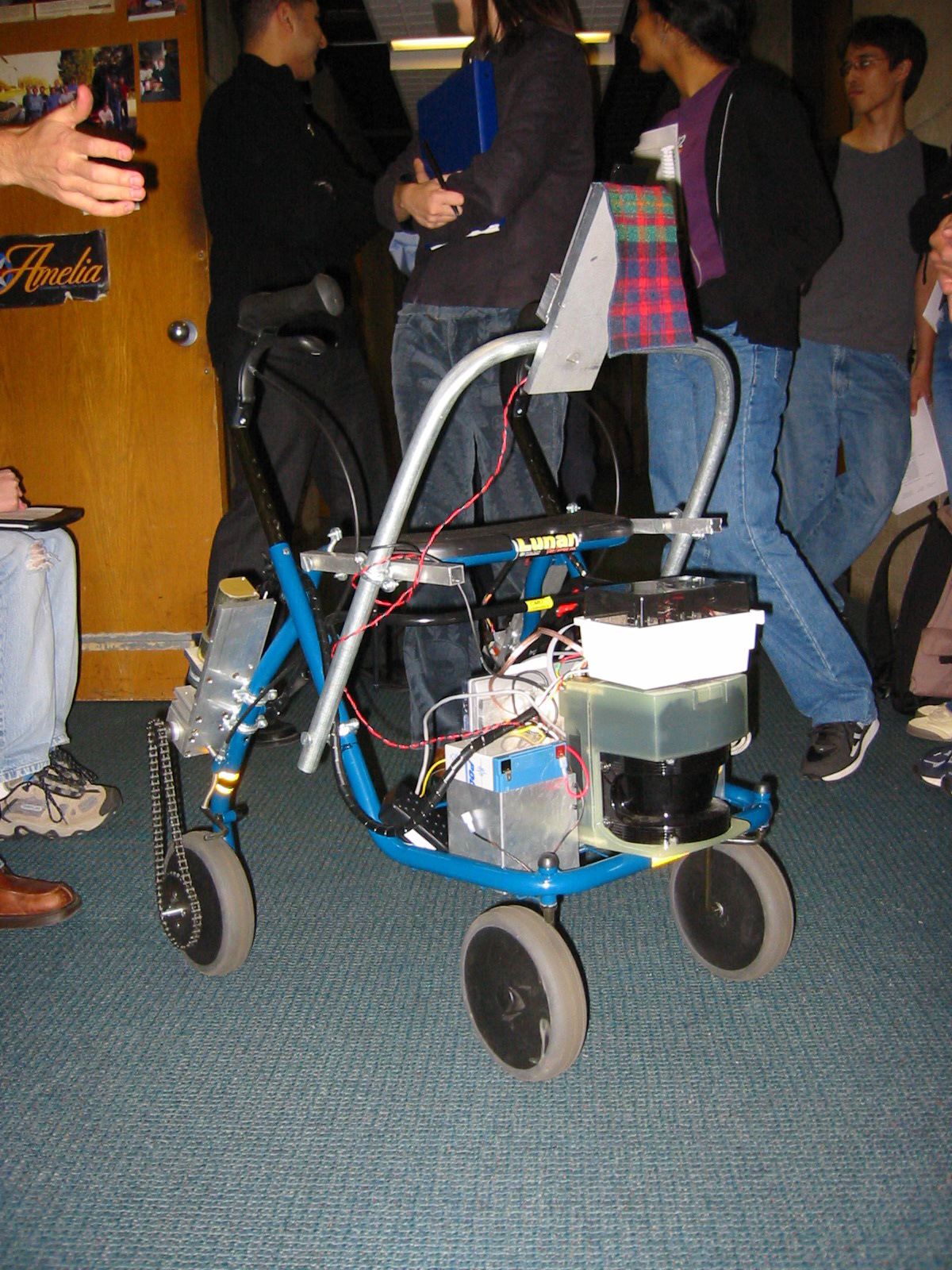
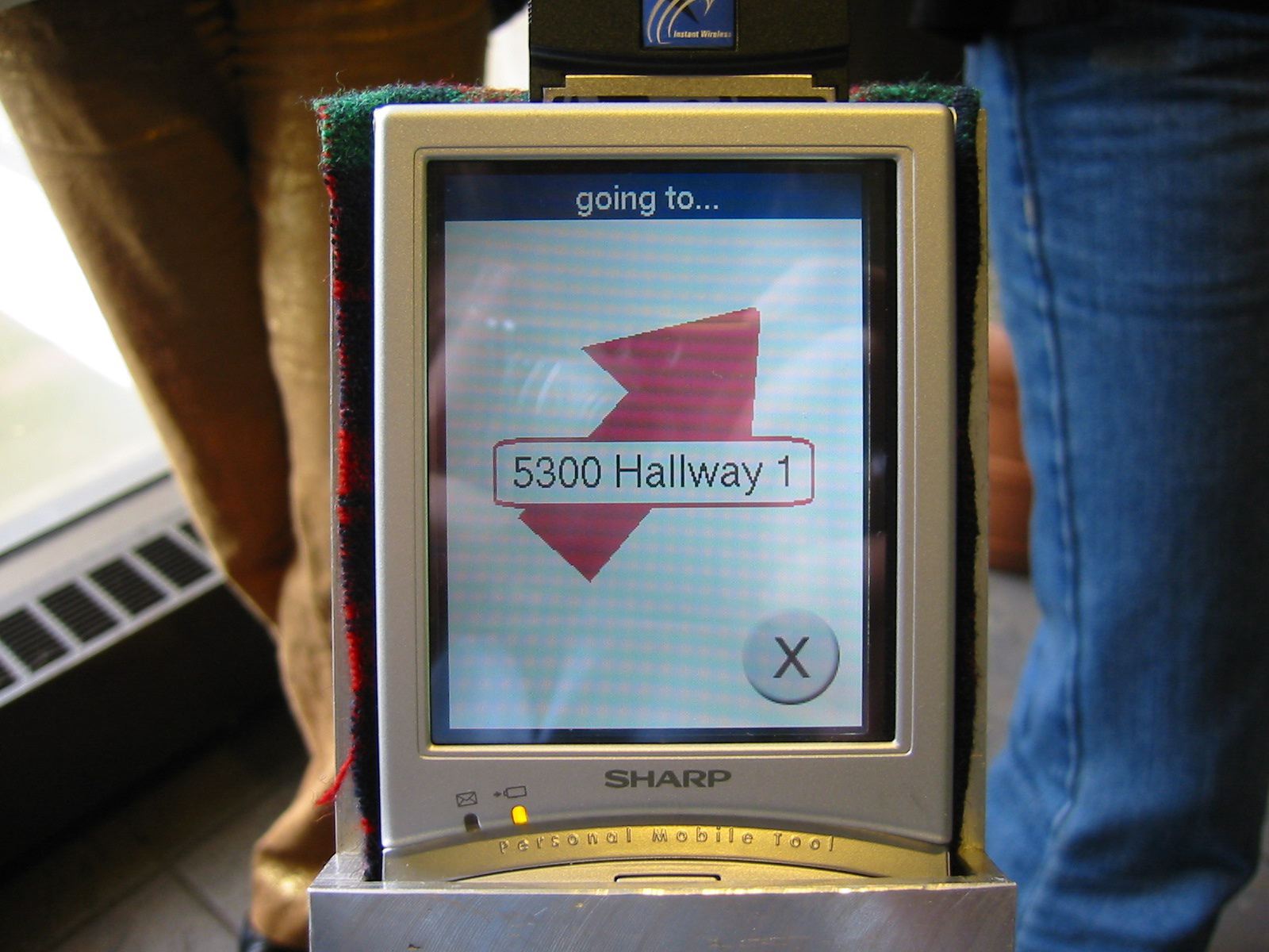
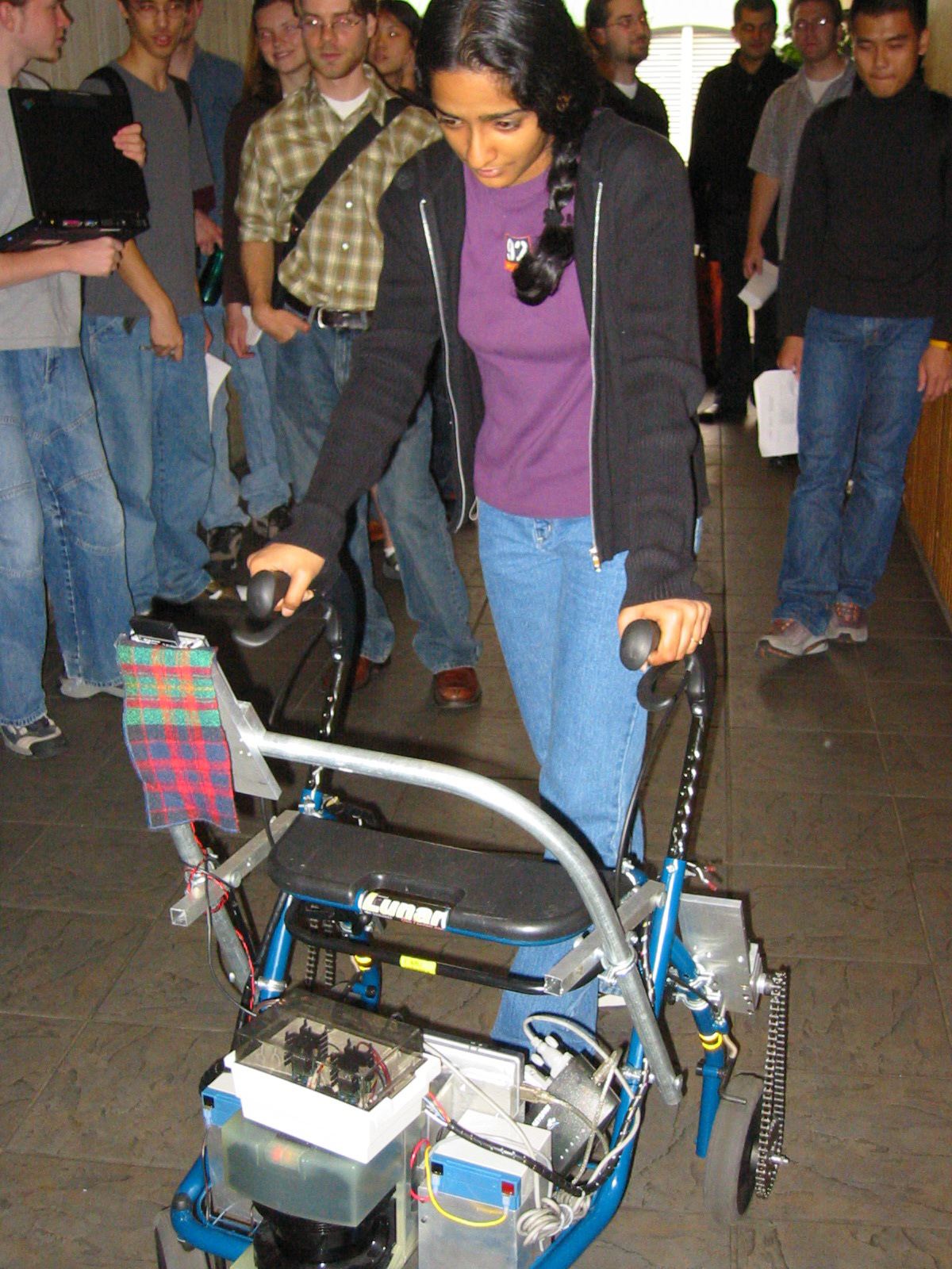
Robot Walker Project UpdateOur project team of Andy Ko, Jeff Howard and me has been hashing out our social robotic walker interface over the last two weeks. Kerry Bodine helpfully provided some pictures of the walker and its interface in its current state. Click on any image for the full size:  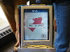 
After figuring out the target users (pdf 116k), we put together some personae (pdf 112k) and ran them through scenarios (pdf 116k). We did some research on the vision of the elderly and figured out what that meant for our typefaces (HUGE: 48pt Frutiger 55). That, combined with the screen size (1024x768, 10" screen) we were given, we generated a set of wireframes (pdf 176k). The next steps are doing a paper prototype test with a version of the wireframes, then starting to work on visual designs. And then a flash prototype. Whew.
posted at 07:45 PM in
projects
| comments (0)
| trackback (0)
| link
School PicturesThe first year students' pictures and bios are finally up on CMU's website. It's interesting to note how people present themselves vs. how they actually are. But see for yourself: interaction design students and communication planning and information design.
posted at 03:58 PM in
classmates
| comments (1)
| trackback (0)
| link
Tuesday, October 21, 2003
Color BasicsDan Boyarksi gave some of us a quick lecture on the basics of color. There are three main properties of every color: the hue, the value (or brightness), and the intensity (or saturation). Hue is the color itself. Value indicates how much black is in the color; how dark or light it is. Intensity is how pure or dull the color is. When picking a suite of colors, try to keep them all at around the same value. Look for equal values and saturation. To dull a color, add in color from the opposite side of the . White backgrounds tend to darken up colors. Black backgrounds tend to lighten colors. Try backgrounds that aren't pure white or black. White backgrounds can even deaden colors, so try a light grey. Very pale yellow backgrounds with black type is good for older eyes. Painter Josef Albers said that color doesn't exist until it meets another color. "If you remember one thing from this lecture," Dan said, "Remember to look at the edges of colors and see how they work together."
posted at 08:45 PM in
design 101
| comments (0)
| trackback (0)
| link
Sunday, October 19, 2003
Illegibility Rough CutI'm working on my visualizing information space project for Studio these days, which mainly consists of me wrestling with Flash to get it to perform like After Effects. Last week, I presented (along with everyone else in the class) a small part of the project (485k swf). It got a good response, but I am not very happy with it. The music is wrong, the timing stinks, and the visuals aren't so hot either. And this is one small part of a multi-part series of movies. Due in about a week and a half, I have a lot of work to do.
posted at 10:43 PM in
projects
| comments (0)
| trackback (0)
| link
Mid Term PaperOne of the problems with having professors who also consult is that occasionally they don't have time to teach. That's apparently what happened last week and part of next week as well for Seminar class. So instead of forging ahead with the syllabus, we were stuck doing a paper on a CD-Rom called Sokkuram, a web version of which can be found here. Here's where taking a lot of English Lit classes as an undergrad pays off. It's only a four-page paper, and stuff like that we used to do as a warm-up. I'd often crank out 7-10 page papers in a night. I wrote this one in about three hours. A lot of my classmates are sweating it out, though... We're basically supposed to watch the Sokkuram CD-Rom, then analyze it using the three interpretations of interaction that we've learned up until now. (We should have learned all four by now, but who's counting?)
posted at 10:23 PM in
classes
| comments (0)
| trackback (0)
| link
‹‹ preceding entries
|