December 19, 2004
Final Typography Project
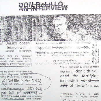
Above is an image from my final typography project: two spreads and the front and back cover of a fake literary/arts journal called Cadence. I chose the 20th anniversary of White Noise, Don DeLillo's National Book Award-winning novel, as my subject matter.
Unfortunately, because of how I made this project (more on that in a second), I can't really post something that's going to do the final piece justice; even a pdf isn't going to look right.
In order to get an arty, grainy, 'zine-like feel, I used a technique that my professor Kristin Hughes taught me. First, you print out your pages backwards and then xerox them. Then you take lacquer thinner and paint it onto a sheet of newsprint (and thus stink up half of the second floor of the design building), then press the xerox onto the newsprint, smoothing it down. When you peel the xerox off the newsprint, the ink from the copy sticks onto the newsprint, giving it the texture you can sort of see above. It's a neat effect.
Posted by Dan at 6:06 PM | Comments (0) | TrackBack
November 24, 2004
Fall '04 Final Projects
The last three weeks of the semester bring with them the final projects of the fall. Here's everything I have to do between now and winter break:
- Journal Layout. For Graduate Typography, designing and laying out six pages of a fake journal. We got to choose the content, so mine is a literary journal whose theme is "20 Years of Don DeLillo's White Noise." (Dec. 14)
- Networked Art Piece for Interactive Graphics. I'm designing a program that fetches custom RSS feeds from Yahoo News based on user input, then shows the headlines in some sort of expressive typography display. (Dec. 9)
- Fine Draft, Thesis Paper. Finishing and refining my draft of my thesis paper. I'm on page 26 of about 35 as of this morning. (Dec. 17)
- Paper Prototype, Pile Cabinets. Create and test a set of paper prototypes of my thesis project. (Dec. 10)
- Poster of my thesis project, to be presented to faculty and classmates (and hopefully at CHI). (Dec. 17)
- Abstract and Paper for CHI on my thesis project, to go along with the poster. (Dec. 6)
Obviously, a busy time.
Posted by Dan at 9:13 AM | Comments (0) | TrackBack
November 23, 2004
Hi M.O.M.
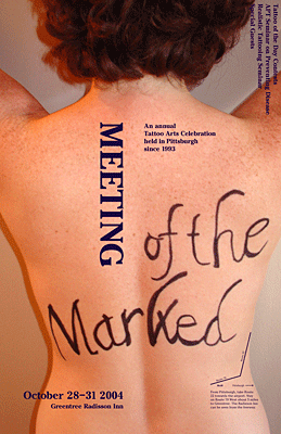 Another week, another poster. This time, an event in a familiar place (ie. Pittsburgh). My event was a local tattoo convention.
Apologies for the large image, but since I'm underwhelmed with how this turned out (despite the best efforts of my model) there's no sense in providing a pdf. But I did want to show it, if only for the hours of effort that was poured into it. And maybe it's not as flawed as I think, who knows.
Posted by Dan at 12:52 AM | Comments (0) | TrackBack
November 16, 2004
Onomatopoeia Poster
 We're running out of time in typography class, so we've collectively decided to pull the plug on the poster project that got put on hold to do posters on a place we've never visited and an event in a familiar place. Which is a shame, because I'm basically done with this poster.
To recap, this poster involved combining an onomatopoetic word (pop, wow, zap) with another word and an image. The three things together were supposed to make some sort of statement. Mine (36k pdf) is, not surprisingly, political.
Posted by Dan at 3:01 PM | Comments (0) | TrackBack
November 8, 2004
A Long Road
HEMINGWAY: I rewrote the end to A Farewell to Arms, the last page of it, thirty-nine times before I was satisfied.
GEORGE PLIMPTON: Was there some technical problem there? What was it that had stumped you?
HEMINGWAY: Getting the words right.
 I'm no Hemingway, but I think I know a little about what Papa is talking about. I've spent the last two days finishing and printing my Unfamiliar Place poster for graduate typography class. This involved hours of kerning and pixel pushing to get the words (and images) right. I'm pretty proud of it; it's probably the most beautiful poster I've ever done. It's about a place I've only visited through music, pictures, and my dreams: Iceland. Take a look (5.1mb pdf)
Posted by Dan at 10:28 PM | Comments (0) | TrackBack
October 19, 2004
MOM Poster
The sister project of the Unfamiliar Place poster (which I'm still working on) is, naturally, the Familiar Place poster. This time around, we're picking an area of Pittsburgh (where CMU is), then find or imagine an event that would take place in this area. The area I've chosen is South Oakland, where this year's Meeting of the Marked (MOM) is taking place. I figure a tattoo convention should provide me with some interesting visuals and typography.
Posted by Dan at 4:23 PM | Comments (0) | TrackBack
September 24, 2004
Personals Typography Project
After an exhaustive amount of work, I finished up the personal ad project for typography class. The final piece (60k pdf) is a series of six 10"x10" panels meant to be read horizontally, flush up against each other.
My takeaways from this: typography is demanding, tedious, and requires a ridiculously sharp eye. It requires patience, but the results can be very beautiful. Who knew that simply moving letters around could eat up so much time?
Posted by Dan at 10:54 AM | Comments (0) | TrackBack
September 18, 2004
Counterform
I must be a slow learner because after three weeks of graduate typography it's finally started to sink in: the space between the letters is just as important as the letters themselves. The shape that's formed between letters and words can be a thing itself and can make or break the whole composition.
Posted by Dan at 1:10 PM | Comments (0) | TrackBack
September 13, 2004
Personals Project
I'm working on a very difficult project now--at least it's difficult for me as a rookie typographer. It's a very challenging (but fun) first assignment for graduate typography.
We had to chose two contrasting personals ads, then pick two typefaces that best represent the two "characters," Male and Female. Using only those fonts and no color or greyscale, we have to do a series of 10"x10" squares of the two fonts/personals meeting, first with just the letters M and F, then with the whole personals ads meeting. My male (Caslon font):
23 year old SWM, 6'3, 235 lbs, decent build, brown hair, brown eyes with goatee. Looking for a F who is affectionate, loves to snuggle, kiss & be affectionate in public & private. If you have kids that is great. I am very passionate & compassionate & you should be too. Please no head games because I just got out of a bad relationship.
My "female" (TriplexLight font):
Very feminine, submissive, bi-WM cross dresser, tall, long legs, slender, loves dressing up. ISO a couple w/a dominant partner or a dominant M or F for frequent get togethers. I love role play, spanking, light bondage. I can entertain at my home or travel.
It's difficult because it seems like type has a limited set of "moves" that can be combined in many different ways to form a whole. In a way, it reminds me of chess, looking at patterns of form and counterform.
Posted by Dan at 3:00 PM | Comments (0) | TrackBack
September 8, 2004
A Sandwich Made of Type
An in-class typography project: Each student had to bring in a sandwich in a brown paper bag to graduate typography class. The sandwiches were "shuffled" and laid out on a long table. Then we each chose two of them to describe: what they were like, what characteristics they possessed, how we thought they were made. And finally, what faces they would be if they were fonts. (Someone suggested my turkey on wheat was like Cooper Black.)We then took our own sandwich, and choosing a font, cut and pasted letters (with real scissors and glue) onto a paper plate to recreate our sandwich. (My sandwich was remade with Trade Gothic.) Interesting.
Posted by Dan at 4:57 PM | Comments (0) | TrackBack
September 7, 2004
Obeying the Rules
My graduate typography class, taught by Kristin Hughes, began with a review of the basic rules of typography, very much like Karen Moyer's lecture on What's Normal.The rules to generally obey are the following:
- For optimum legibility, choose classic, time-tested typefaces with a proven track records.
- Be mindful not to use too many typefaces at once.
- Avoid combining typefaces that are too similar. It looks like a mistake.
- Text set in all capital letters severely retards reading. Use upper and lower case letters for optimum readability.
- For text type, use sizes that according to legibility studies prove most readable. These sizes range from 8-12 points.
- Avoid using too many different types sizes and weights at the same time.
- Use text type of book weight. Avoid typefaces appearing too heavy or too light.
- Use typefaces of medium width.
- For text type, use consistent letter and word spacing (kerning) to produce an even, uninterrupted flow.
- Use appropriate line lengths. Lines that are too short or too long disrupt the reading process.
- For text type, use line spacing (leading) that easily carries the eye from one line to the next.
- For optimum readability, use a flush left, ragged right style.
- Strive for consistent rhythmic rags.
- Clearly indicate paragraphs. You never have to indent the first paragraph of a column.
- Avoid widows (words left on a line by themselves) and orphans (a single word at the beginning of a column or page).
- Emphasize elements within text with discretion. Never combine small caps and regular caps.
- Always maintain the integrity of your type. Avoid stretching or distorting your typefaces or putting text on a curve.
- Always align letters on the baseline or the meanline.
- When working in color, ensure that sufficient contrast exists between type and its background.
Posted by Dan at 2:37 PM | Comments (0) | TrackBack