May 5, 2005
Design is in the Details
Finishing my thesis project prototype this week, it struck me that there's a significant blind spot in CMU's program (and from what I understand, other interaction design schools' programs as well): working with developers on a prototype to get the feel of the thing right. Because at school you very seldom get to the working prototype stage (due to time and money constraints), you don't ever get into the finesse of an interactive design, those tiny things that make a huge difference. And those tiny things can usually only be seen in a working thing that can be played with and broken and fiddled with. Animations and delays and such don't appear in flat paper prototypes and storyboards. At least not well.
CMU is supposedly better at building things than some other schools that have lots of cool ideas and slick videos to go with them, but it could be better. I suppose one could argue that this is what the thesis project is for: to take an idea out to the working prototype phase, but it seems like too important a thing to save until the very end of your graduate education. Especially considering that many people don't make it to the working prototype phase in their thesis work, or do projects that would be almost impossible to do that with without a team of developers.
Posted by Dan at 10:56 AM | Comments (1) | TrackBack
March 30, 2005
The Process of Designing for Service
The process of designing a service is still being developed because it's new. Here are some of the stages and their steps suggested by Shelley Evenson.
- Discovery. Identify the environment, customers, and stakeholders.
- Environment Description. Describe the situation to be addressed. Why this situation? Who is involved? Use images to ground the situation.
- Stakeholder Description and/or Model. Who are the people who need to be addressed and who will be affected?
- Company Perception and Core Competency. What are the expectations of the customers? What is the company good at?
- Market Conditions. What makes this service something the organization would engage in? Is there a customer demand or need?
- Brand Perception. How is the company perceived and what expectations are set by its brand?
- Touchpoints. What are the key touchpoints? Include communications, identity, naming, network of partners, physical locations, etc.
- Research Overview. What types of research did you conduct? With whom? Why?
- Synthesis. About making deep connections with the stakeholders and customers.
- Customer Typologies. Diagram or listing of characteristics, expectations, goals, and tasks.
- Pathway or Process Mapping. High-level view of the overall experience and where the design work being done falls in the overall experience. Shows boundaries: what's in and what's out. What is the customer journey? Where are the touchpoints?
- Cultural Conditions. What's going on with the organization. Will the organization make the recommended changes? How can you get the organization involved?
- Construct.
- Personas. Document characters to play out in the scenarios/stories of the future state.
- Understand Key Service Moments. Find the crucial moments and those moments that can be easily and inexpensively changed. What will deliver the most value?
- Sketch Prototypes of the Moment Ideas. Show who, what stage in the process, and what the value would be.
- Put Moments Together in a Scenario/Service String. Put the moments together to create a future state. This is the place to show the BIG idea in written and visual form (storyboards).
- Enactments. Play out the scenarios as theatre. Victor Turner says that in doing ethnographies, one of the best ways to move away from your personal view is to enact scenarios as theatre. This will show how the service will feel.
- Refinement.
- Service Evaluation. Ways to bring a prototype to life so that you can get feedback on it. An example are "pilot programs" at a small number of locations.
- Service Strategy. Way of communicating the new in a nutshell. Communicating why are we doing this? What's the value? What is the approach? How are you going to support the change?
- Service Documentation. One page/poster that illustrates and documents the elements of the service strategy. What are all the elements? What needs to be produced? Who will be involved? What needs to happen "on stage" and "back stage"? How is it consistent with the brand and identity?
Posted by Dan at 12:04 AM | Comments (1) | TrackBack
January 31, 2005
What to Model
From Shelley Evenson's conceptual models class: The types of things you want to think about modeling and why:
- Processes. Procedures and particular courses of action or the performance of some composite cognitive activity.
Why model processes? Breakdowns become obvious. You can tell what is and what isn't part of the process. Discussions can be had about where/when an intervention needs to be made by a designer. Comparing documented processes among parallel approaches can reveal why one is more of less successful than the other.
- Attitudes. A complex mental state involving beliefs, feelings, and values.
Why model attitudes? People change their attitudes based on lots of things ranging on how they feel physically to how competent they feel about a task. Ideally, experiences should map to whatever attitude the person has at a particular moment (so it feels designed for them personally). Or so that you can choose to not design for an attitude.
- Approaches. Plans of attack. Ways to start doing a task or set of tasks.
Why model approaches? Because they reveal what the general perception of something is and make explicit the methods used or plan made. Understanding different approaches (especially from superusers) may reveal unique strategies that can benefit all users.
- Elements. All the little bits of something.
Why bother modeling these? To see the relationships, to get quantitative data (like how many of something there is), to see opportunities amid clusters.
- Archetypal Users. AKA Personas.
Why model these? Only after synthesizing user data can we begin to create patterns of interactions that smoothly match the behaviors, mental models, and goals of users. Can illuminate lifestage, experience level, motivations. You need them to drive scenarios.
Posted by Dan at 4:48 PM | Comments (0) | TrackBack
January 19, 2005
The Ways of Representing Things
From Shelley Evenson's Conceptual Models class:
- Spider Diagram. Organized by placing something in the center and radiating sub-ideas outwards.
- Process Flow: Linear. Shows how concepts and activities unfold, usually over time. They can be produced at a variety of levels of resolution and are good for helping teams identify possible points of intervention.
- Process Flow: Circular. Shows how concepts or activities repeat. They can sometimes loop within steps.
- Venn Diagrams. A favorite of consulting firms everywhere, venn diagrams are a way to represent sets and relationships to show what elements of an experience are shared and what is unique. They can be used to show just about anything.
- 2 x 2 Matrix. useful tool for initial sorting of data. Good for categorizing things that can be reduced to two simple variables. Enables a rapid clustering (or separating) of information into four categories.
- System Diagram.Shows a group of independent but interrelated elements comprising a unified whole.
- Maps. Usually deal with depicting some aspect of physical space and a person's interaction with it. Gives a sense of overview.
Posted by Dan at 9:51 PM | Comments (1) | TrackBack
December 19, 2004
Final Typography Project
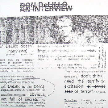
Above is an image from my final typography project: two spreads and the front and back cover of a fake literary/arts journal called Cadence. I chose the 20th anniversary of White Noise, Don DeLillo's National Book Award-winning novel, as my subject matter.
Unfortunately, because of how I made this project (more on that in a second), I can't really post something that's going to do the final piece justice; even a pdf isn't going to look right.
In order to get an arty, grainy, 'zine-like feel, I used a technique that my professor Kristin Hughes taught me. First, you print out your pages backwards and then xerox them. Then you take lacquer thinner and paint it onto a sheet of newsprint (and thus stink up half of the second floor of the design building), then press the xerox onto the newsprint, smoothing it down. When you peel the xerox off the newsprint, the ink from the copy sticks onto the newsprint, giving it the texture you can sort of see above. It's a neat effect.
Posted by Dan at 6:06 PM | Comments (0) | TrackBack
October 26, 2004
System Boards
We were introduced to the concept of system boards in typography last week. System boards are to print compositions as the frame is to a house: something that defines the structure, but allows for both refinement and modification.
System boards allow you to work in pure line or form, making a skeleton of the composition. You establish an identity, a formal structure, then push and pull your content within that identity. In a way, it is the separation of information from the composition, allowing you to find flow lines, a grid structure, and modular/non-modular sections. I wish I had an example to show you; they look like very simple, grid-like sketches of lines.
Posted by Dan at 3:06 PM | Comments (0) | TrackBack