April 10, 2005
Lost Time
I've been traveling so much lately I feel like I've lost two weeks of school--and I suppose I have. This leaves me with only about a month to finish:
- an eight-page paper on Herb Simon's Administrative Behavior
- reading said 300+ page book
- testing and refining my thesis project
- designing and printing my process book for said thesis project
- presenting said thesis project to the faculty and students
- finishing writing my thesis paper
- nicely formatting said thesis paper
- printing said thesis paper on nice paper for binding
- presenting a redesign of CMU's parking service tomorrow
- designing, documenting, and presenting an improved experience for Pittsburgh's T subway
And that's just schoolwork. This isn't even mentioning the ongoing job interviews and negotiations, house hunting from 2000 miles away, teaching my class, and various extracurricular things coming up like CMU's Carnival coming up next weekend.
Oy.
Posted by Dan at 9:22 PM | Comments (1) | TrackBack
March 3, 2005
My Own Private Conceptual Model
I finished my last project for my Conceptual Models class: a model of CMU's BlackBoard system (15k pdf). I'm pleased with its clarity and ease of use.
Posted by Dan at 7:19 PM | Comments (0) | TrackBack
February 26, 2005
Group Conceptual Model
Our group for conceptual models (me, Phi-Hong Ha, Harlan Weber, and Purin Phanichphant) came up with this model of CMU's Blackboard System (404k pdf).
Posted by Dan at 1:09 PM | Comments (0) | TrackBack
February 17, 2005
Communication Conceptual Model
In conceptual modeling, our first project was to listen to one of our classmates tell a story about an important communication, then build a conceptual model based off the data that we gathered during the session. My group's storyteller was fighting with her identical twin, and her story involved lots of twists and turns and was very complicated. I tried to strip out most of the "details" and get down to essence of what the story was about. Thus, this conceptual model (13k pdf).
Posted by Dan at 8:40 AM | Comments (0) | TrackBack
December 19, 2004
Final Typography Project
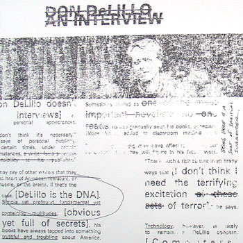
Above is an image from my final typography project: two spreads and the front and back cover of a fake literary/arts journal called Cadence. I chose the 20th anniversary of White Noise, Don DeLillo's National Book Award-winning novel, as my subject matter.
Unfortunately, because of how I made this project (more on that in a second), I can't really post something that's going to do the final piece justice; even a pdf isn't going to look right.
In order to get an arty, grainy, 'zine-like feel, I used a technique that my professor Kristin Hughes taught me. First, you print out your pages backwards and then xerox them. Then you take lacquer thinner and paint it onto a sheet of newsprint (and thus stink up half of the second floor of the design building), then press the xerox onto the newsprint, smoothing it down. When you peel the xerox off the newsprint, the ink from the copy sticks onto the newsprint, giving it the texture you can sort of see above. It's a neat effect.
Posted by Dan at 6:06 PM | Comments (0) | TrackBack
November 24, 2004
Fall '04 Final Projects
The last three weeks of the semester bring with them the final projects of the fall. Here's everything I have to do between now and winter break:
- Journal Layout. For Graduate Typography, designing and laying out six pages of a fake journal. We got to choose the content, so mine is a literary journal whose theme is "20 Years of Don DeLillo's White Noise." (Dec. 14)
- Networked Art Piece for Interactive Graphics. I'm designing a program that fetches custom RSS feeds from Yahoo News based on user input, then shows the headlines in some sort of expressive typography display. (Dec. 9)
- Fine Draft, Thesis Paper. Finishing and refining my draft of my thesis paper. I'm on page 26 of about 35 as of this morning. (Dec. 17)
- Paper Prototype, Pile Cabinets. Create and test a set of paper prototypes of my thesis project. (Dec. 10)
- Poster of my thesis project, to be presented to faculty and classmates (and hopefully at CHI). (Dec. 17)
- Abstract and Paper for CHI on my thesis project, to go along with the poster. (Dec. 6)
Obviously, a busy time.
Posted by Dan at 9:13 AM | Comments (0) | TrackBack
Drawing with Fungus
 It's been a while since I've posted any projects from my interactive graphics class. I just finished this small drawing program (page with 108k java applet). I was trying for an organic feel with the spreading ink and it ended up looking like growing mold. Some of my classmates solutions
Posted by Dan at 8:37 AM | Comments (0) | TrackBack
November 23, 2004
Hi M.O.M.
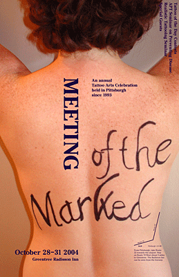 Another week, another poster. This time, an event in a familiar place (ie. Pittsburgh). My event was a local tattoo convention.
Apologies for the large image, but since I'm underwhelmed with how this turned out (despite the best efforts of my model) there's no sense in providing a pdf. But I did want to show it, if only for the hours of effort that was poured into it. And maybe it's not as flawed as I think, who knows.
Posted by Dan at 12:52 AM | Comments (0) | TrackBack
November 16, 2004
Onomatopoeia Poster
 We're running out of time in typography class, so we've collectively decided to pull the plug on the poster project that got put on hold to do posters on a place we've never visited and an event in a familiar place. Which is a shame, because I'm basically done with this poster.
To recap, this poster involved combining an onomatopoetic word (pop, wow, zap) with another word and an image. The three things together were supposed to make some sort of statement. Mine (36k pdf) is, not surprisingly, political.
Posted by Dan at 3:01 PM | Comments (0) | TrackBack
November 8, 2004
A Long Road
HEMINGWAY: I rewrote the end to A Farewell to Arms, the last page of it, thirty-nine times before I was satisfied.
GEORGE PLIMPTON: Was there some technical problem there? What was it that had stumped you?
HEMINGWAY: Getting the words right.
 I'm no Hemingway, but I think I know a little about what Papa is talking about. I've spent the last two days finishing and printing my Unfamiliar Place poster for graduate typography class. This involved hours of kerning and pixel pushing to get the words (and images) right. I'm pretty proud of it; it's probably the most beautiful poster I've ever done. It's about a place I've only visited through music, pictures, and my dreams: Iceland. Take a look (5.1mb pdf)
Posted by Dan at 10:28 PM | Comments (0) | TrackBack
October 19, 2004
MOM Poster
The sister project of the Unfamiliar Place poster (which I'm still working on) is, naturally, the Familiar Place poster. This time around, we're picking an area of Pittsburgh (where CMU is), then find or imagine an event that would take place in this area. The area I've chosen is South Oakland, where this year's Meeting of the Marked (MOM) is taking place. I figure a tattoo convention should provide me with some interesting visuals and typography.
Posted by Dan at 4:23 PM | Comments (0) | TrackBack
October 14, 2004
Intermorphable Alphabet
I finally finished my intermorphable alphabet (120k java applet) for my interactive graphics class. The project was to come up with a "font" in which any letter can morph into any other letter. Mine is a "block and bubbles" alphabet, composed of bubbles inside blocks that move around. I tried (unsuccessfully) to get the bubbles to break out of the blocks while moving, but I never got it to work right.
Posted by Dan at 12:51 PM | Comments (1) | TrackBack
October 3, 2004
A Place You've Never Visited
Ben Day, co-author of Typographic Design: Form and Communication and communication design professor at Virginia Commonwealth University, is visiting CMU all next week and will be working my graduate typography course. We'll be creating a poster about a place we've never visited. It can be a real or imaginary place.
The poster is supposed to be very impressionistic. That is, we're not to get images of the actual place, but instead gather images and words about the texture, smell, architecture, and culture of the place. How we imagine it to be.
I've chosen a place I've always wanted to visit but have never gotten around to it: Iceland.
Posted by Dan at 12:38 PM | Comments (0) | TrackBack
September 24, 2004
Personals Typography Project
After an exhaustive amount of work, I finished up the personal ad project for typography class. The final piece (60k pdf) is a series of six 10"x10" panels meant to be read horizontally, flush up against each other.
My takeaways from this: typography is demanding, tedious, and requires a ridiculously sharp eye. It requires patience, but the results can be very beautiful. Who knew that simply moving letters around could eat up so much time?
Posted by Dan at 10:54 AM | Comments (0) | TrackBack