 |
 |
 |
 |
 |
Final Typography Project
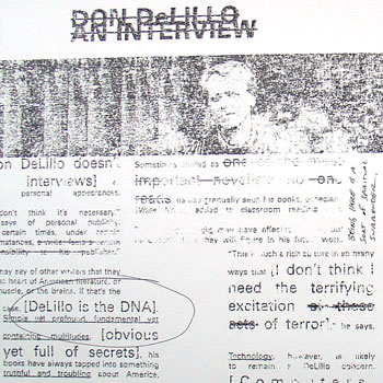
Above is an image from my final typography project: two spreads and the front and back cover of a fake literary/arts journal called Cadence. I chose the 20th anniversary of White Noise, Don DeLillo's National Book Award-winning novel, as my subject matter.
Unfortunately, because of how I made this project (more on that in a second), I can't really post something that's going to do the final piece justice; even a pdf isn't going to look right.
In order to get an arty, grainy, 'zine-like feel, I used a technique that my professor Kristin Hughes taught me. First, you print out your pages backwards and then xerox them. Then you take lacquer thinner and paint it onto a sheet of newsprint (and thus stink up half of the second floor of the design building), then press the xerox onto the newsprint, smoothing it down. When you peel the xerox off the newsprint, the ink from the copy sticks onto the newsprint, giving it the texture you can sort of see above. It's a neat effect.
Originally posted on Sunday, December 19, 2004
| Search Entries |